A logo is the most important visual appearance of any brand. A brand without a logo doesn’t exist. It is a tool that customers use to identify your brand. With such importance put on a logo, how do you design on from scratch? In our 2024 guide, we will dive deeper into the subject and explain how to design a logo from nothing.
Contents
Scout the Competition
This is the first and most important step when designing a logo. It’s safe to say that not everyone is an expert graphics designer. Graphics design is a skill that comes naturally to some. For others, it needs to be honed and perfected.
While no one is perfect, chances are you might have a hard time designing a logo from scratch for your business. In that case, there isn’t a better place to start than to scout the competition. By doing so, you’re finding inspiration where to start.
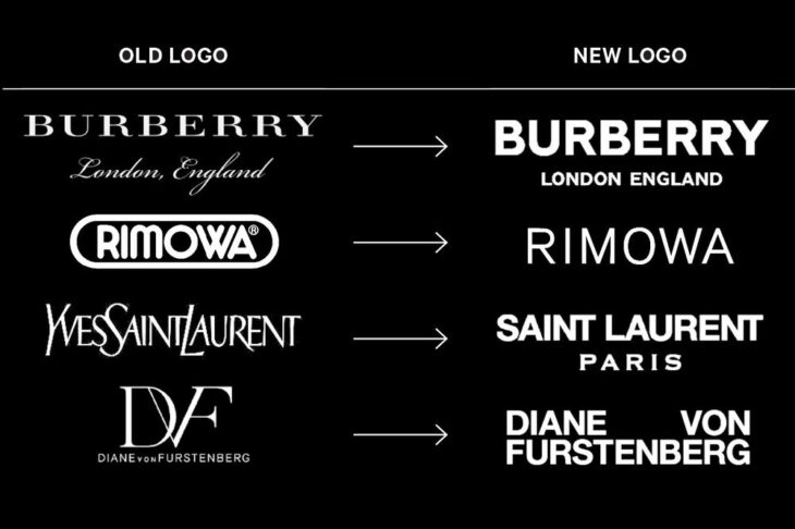
Your competitors might have a bad logo, or they might have the best in the industry. Take inspiration from multiple competitors and think about the unique points in every logo.

Source: fabrikbrands.com
Go For A Style
Once you find inspiration for your logo, the next step is to go for a style. When it comes to choosing a style, there is a plateau of styles to choose from. Some of the styles that exist are the following:
• Classic style
A classic style is an aesthetic path that is both simple and functional. This style might very well work for your business as it captures a modern look. However, a classic look will not work for any brand. The classic style uses fewer, contrasting colors, simple fonts, and doesn’t go in any wacky or silly direction.

Source: DesignProficient.com
• Retro style
A retro style is essentially what it suggests. Retro or vintage logos are trendy again as they’re quite nostalgic. With all that said, this style is quite flip-floppy when it comes to trendiness. Sooner or later, it will go out of fashion.
To design a retro style, you need to pay careful attention to your brand personality. A retro logo only works if your company has a history to back the style.
• Minimalistic style
A minimalistic style absolutely works. This style is also a functional style that is modern and to the point. It involves the use of colors, but no borders. It uses lots of whitespaces and doesn’t get into details at all. A minimalistic style looks stylish, sleek, and tells customers that you’re keeping up with the times. For new brands and companies, a minimalistic style often works best.
Before wrapping it up, there are two additional styles to go for. The first is the fun or quirky style, and you can have quite a lot of freedom when designing your logo. A fun or quirky style, unfortunately, only works if your business revolves around a particular, younger demographic.
The second and last style is the handmade style. It only works for brands or businesses that personify the handmade quality. In most cases, a handmade style will use plenty of design aspects from the retro style. Where they differ is in the way customers perceive your brand. If a brand with a retro style is perceived as having history, a handmade style looks youthful and sophisticated.
Picking the design style is often the most difficult part. Chances are, you will struggle to make your mind up on the right one. For that reason, why not hire a logo designer that can point you in the right direction? If you’re interested in that, make sure to click here to get in touch with a quality freelance business logo designer.

Source: lthszj.com
Choosing Colors
The style is important, but the color makes the logo tick. The right color can have a significant impact on emphasizing your brand personality. A business that makes kids’ toys will use bright colors that translate to fun.
There are a few color categories you need to pay attention to. Despite what you might think, certain colors will not work for your business. So here are a few things to consider.
- Bright colors are fun and work best for businesses such as toy stores. The whole point of using bright colors is to emphasize the fun element of your business.
- Black and white are two particular colors that work excellently together. However, the whole point of using black and white is to emphasize a slick or minimalistic look.
- A single color will work wonders for logos that are made out of only words. The only other color on these logos is the background. In most cases, the background should be a contrasting color to the color you use for the words.
- Combining multiple colors, or color combinations works best for businesses that want to stand out. The whole point of going for a myriad of colors is to make the design stand out from the rest. That doesn’t mean color combination will work for your business.

Source: bloomberg.com
Choosing A Font
The next step is to choose a font. Despite what many of you might think, font plays an important role in the way customers perceive your brand. If your logo is a lettermark or wordmark, you must spend more time researching and finding the right font.
There are four types of fonts to go for. Those are serif, sans serif, display, and script fonts. Serif fonts look more serious. Sans serif fonts essentially lack the serifs used in the previously mentioned font. The purpose of sans serif fonts is for the font to look cleaner.
Script fonts resemble handwritten fonts. While this type of font does spread into multiple other categories, the whole point is to emphasize elegance. Display fonts are the most diverse group of fonts. This font has nothing in common with the many subcategories that exist. You will find that display fonts might look minimalistic, or they might look decorative. There isn’t a middle ground with display fonts.
Fortunately, brands find a lot of success with display fonts.

Source: bloomberg.com
Finishing Thoughts
Once you pick a style, color, and font, the next step is to do a mockup of your logo. You will spend hours drawing the perfect mockup. But once you find it, give it to a logo designer to translate it into digital media.
