Wireframing stands as the pivotal element in the design process, acting as a visual guide that delineates the skeletal framework of a website or application. Much like the blueprint of a building, it meticulously lays out the structure, ensuring that every detail is accounted for before the final construction commences. Wireframes play a crucial role in ensuring that every stakeholder, be it designers, developers, or clients, shares a unified vision. As the digital realm has progressed, so has the art of wireframing. It has gracefully transitioned from rudimentary sketches to polished digital representations, mirroring the dynamic and ever-evolving landscape of design.
Contents
- Delving into Low Fidelity Wireframes
- Sketching: The Genesis of Design
- Building the Basic Structure
- Prioritizing Content and Functionality
- Iterative Refinement
- Adding Basic Interactions
- Gaining Stakeholder Approval
- Transitioning to High Fidelity
- Incorporating User Feedback
- Collaboration between Design and Development
- Conclusion: A Bridge between Concept and Reality
Delving into Low Fidelity Wireframes

Source: mockplus.com
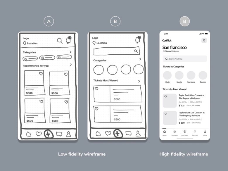
Low fidelity wireframes, colloquially known as ‘lo-fi’, serve as the foundational visual representations of a design’s structure. Stripped of color, intricate typography, and detailed design elements, they present a bare-bones version of the design. Their primary emphasis lies in mapping out functionality, layout, and charting the overall user journey. The beauty of these wireframes lies in their unadulterated simplicity. This clarity becomes an asset, enabling designers to swiftly iterate, adapt, and implement changes, all without the constraints of detailed design elements clouding the process.
Sketching: The Genesis of Design
In an era predating the ubiquity of digital tools, designers found solace in the tactile feel of pen on paper, using it as their primary medium to brainstorm and ideate. Sketching, with its immediacy, offers a conduit to swiftly transform ephemeral ideas into palpable visual concepts. These hand-drawn sketches, albeit basic, encapsulate the core essence of a vision. They act as the initial draft, the first tangible manifestation of a concept, and often lay the groundwork for the subsequent creation of low fidelity wireframes. These sketches symbolize the nascent, unrefined inception of a design’s journey.
Building the Basic Structure
Transitioning from hand-drawn sketches to digital wireframes signifies a pivotal moment in the design journey. Utilizing advanced tools, designers strategically employ basic shapes, lines, and placeholders to symbolize key elements such as buttons, images, and text blocks. This phase is not just about representation; it’s about precision. The emphasis is sharply on defining the layout, ensuring meticulous spacing, and firmly establishing a lucid hierarchy of information, setting the foundation for subsequent design stages.
Prioritizing Content and Functionality

Source: searchengineland.com
In the realm of low fidelity wireframes, aesthetics gracefully step aside, allowing content and functionality to take the spotlight. Designers, with a keen eye for detail, use placeholders to accurately represent text and images, ensuring that every piece of content has its rightful place within the structure. This stage is more than just organization; it’s about strategic placement. It’s pivotal for charting out the user’s journey through the process, ensuring that vital information isn’t just accessible, but also intuitively positioned.
Iterative Refinement
Design, at its core, is an ever-evolving art form, rarely confined to a linear trajectory. It thrives on constant iteration, meticulous refinement, and thoughtful evolution. Every choice, every alteration, is a response to a myriad of influences. As diverse feedback streams in, be it from collaborative team members, invested stakeholders, or insightful user testing, the wireframes adapt and transform. This iterative dance, a blend of creativity and feedback, ensures that the concluding design isn’t just visually appealing but is staunchly user-centric. It becomes a harmonious blend, adeptly meeting both business aspirations and user expectations, ensuring a design that resonates.
Adding Basic Interactions
At the outset, low fidelity wireframes might seem devoid of dynamism, presenting a skeletal view of the design. However, beneath this simplicity lies the potential to breathe life into the user journey. Designers, armed with their innovative prowess and a keen understanding of user behavior, can seamlessly introduce clickable elements. These elements act as signposts, guiding stakeholders through the intricate labyrinth of navigation paths and user flow. These initial interactions, though basic, are pivotal. They offer a tantalizing glimpse into the eventual interactive shape, setting the stage and whetting the appetite for a more immersive prototyping experience, where it truly comes alive.
Gaining Stakeholder Approval

Source: hygger.io
Strategically presenting low fidelity wireframes to stakeholders is a calculated move in the design chessboard. Their inherent simplicity acts as a lens, directing stakeholders to focus intently on the design’s skeletal structure and core functionality, shielding them from potential distractions of intricate design nuances. Securing this early nod of approval isn’t just a checkpoint; it’s a validation that its trajectory aligns seamlessly with overarching business goals, optimizing both time and resources.
Transitioning to High Fidelity
As the design narrative unfolds, the humble low fidelity wireframes undergo a metamorphosis, blossoming into their high fidelity counterparts. These evolved wireframes don’t just represent; they dazzle. They weave in detailed elements, from vibrant color palettes, eloquent typography to intricate motifs. They don’t just show the design; they immerse the viewer, offering a vivid, almost tangible representation of the impending final product, layered with rich visual context.
Incorporating User Feedback
User feedback isn’t just a tool; it’s the compass guiding the design journey. As it transition to their high fidelity stage, user testing shifts from being important to imperative. Authentic feedback, sourced from real users, becomes the chisel, refining the design, ensuring it’s not just functional but also intuitively user-centric. The malleable nature of low fidelity wireframes makes them the ideal canvas, accommodating iterative tweaks based on these golden nuggets of user insights.
Collaboration between Design and Development

Source: developertown.com
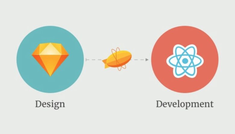
Refined wireframes act as the sturdy bridge, seamlessly connecting the realms of design and development. Developers, armed with these wireframes, have a clear roadmap, ensuring the final product is a true reflection of the artist’s vision. But it’s not just about visuals; annotations play a pivotal role. These detailed notes, embedded within wireframes, act as guiding stars, elucidating design intricacies, fostering a harmonious and efficient collaboration between designers and developers.
Conclusion: A Bridge between Concept and Reality
The journey from rough sketches to refined wireframes is a testament to the design’s evolution. Wireframes, in their various forms, bridge the gap between a design’s concept and its realization. They ensure that every stakeholder, from designer to developer and client, is aligned in their vision. As it continues to evolve, the value of wireframes remains constant, emphasizing their crucial role in the design process.
