In the digital era, user experience (UX) design is more important than ever for businesses – and this is especially true for bankers. Banking applications are the face of the banker to the public, so a poor UX/UI design can lead users nowhere. Most banking applications are still poorly designed, with confusing matrix UX that makes it difficult for users to find what they need. However, some best practices can help designers create a better UX/UI for banking applications.
Contents
- How important is UX in Personal-Banking development?
- 10 Best Practices for UX Design for Personal-Banking Applications
- Make the registration process as easy as possible
- Highlight the most important
- Be Careful in Designing Your Menu Hierarchy
- More visual cues and less text
- Use the menu icons to match the operations
- Create a sense of completion
- Create a detailed transaction history
- Let’s customize the menu
- Let’s use templates and autocomplete
- Always write the final purchase price
How important is UX in Personal-Banking development?
To design a banking app that will be well-received by users, it is important to understand why UX has become so important to the banking industry. According to Money Summit’s findings:
- 71% of customers favor a simple and easy digital experience;
- 33% of customers have stopped using a mobile banking app due to poor user experience.
- 34% of customers have switched financial service providers because of dissatisfaction with digital experiences.

Source: qubstudio.com
10 Best Practices for UX Design for Personal-Banking Applications
People love it when they can understand at a glance what is where. All mobile banking users have worked with similar applications before. It is wise to use this experience, and not retrain them from scratch. Just use the latest techniques applicable to banking applications to the maximum, and the results will not be long in coming.
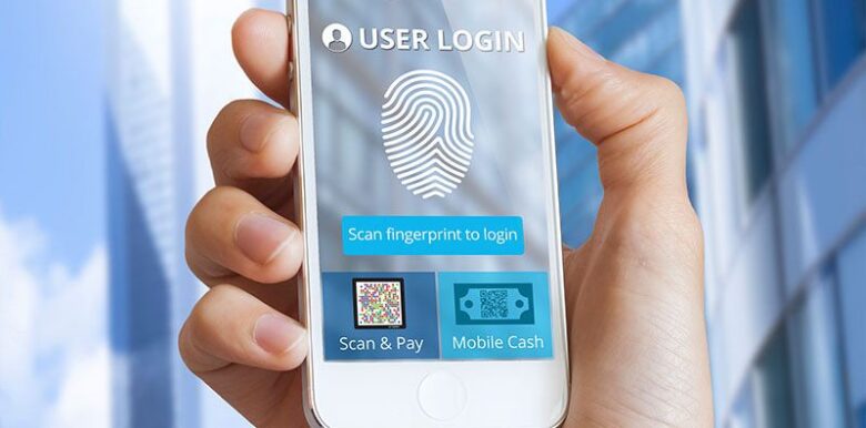
Make the registration process as easy as possible
When it comes to banking apps, security is always a top priority. That’s why banks require users to provide a wide range of personal information when they sign up for an account. While this may seem like a time-consuming process, there are ways to reduce the number of steps and make each step as simple as possible. Another way to improve the user experience of the registration process is by applying electronic Know-your-Customer (eKYC) guidelines. By following these guidelines, banks can collect the necessary information while minimizing the inconvenience to users. As a result, everyone can benefit from a more streamlined and secure banking experience.
Highlight the most important
Design for banking apps is something that should be carefully considered. Different people use different features of an app, and it is important to design an interface that is both intuitive and visually appealing. Each of the potential customer groups should have access to the necessary functions or information within a distance of no more than 2 clicks on the menu.
The most popular features of a banking app are:
- checking account balances (83%);
- paying bills and transferring money (58%);
- viewing transaction history (43%);
- branch and ATM map (41%).
However, other features such as a currency converter and contacts for banks can also be useful. Try to bring these menus to the main screen so that you do not have to look for them for a long time.

Source: toptal.com
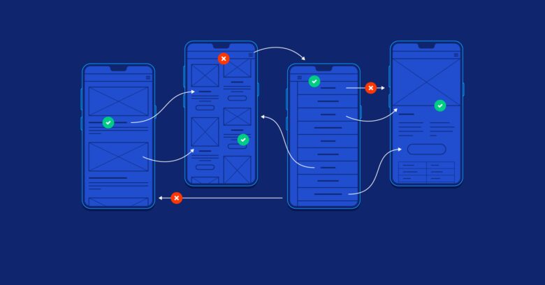
Be Careful in Designing Your Menu Hierarchy
Hierarchical menus can be confusing for users, who may have to tap a menu to see other menus. Flat menus, or shallow navigation, allow users to see all the menus in one interface and go directly to the thing they want to do with one tap. This saves time and is more user-friendly. When designing your UI, keep the user in mind and consider using flat menus. Your users will thank you for it!
More visual cues and less text
When designing user interfaces, it’s important to remember that people naturally favor visual cues over long texts. This means that you should carefully choose visuals that illustrate the actions that users will make. You should only choose enough visuals to communicate the message clearly, without overwhelming users with too many icons and images. If done correctly, visual cues can help make your user interface more intuitive and easy to use.
Good icons are key to any effective user interface. They communicate actions and concepts quickly and efficiently, without the need for words. However, not all icons are created equal. The best icons are concrete and multi-colored, rather than abstract and single-colored. For example, the “Help” button is better presented as an icon of “person with headsets”, rather than the question mark. This is because it is more easily recognizable and therefore more user-friendly. When it comes to choosing icons for your UI/UX, A/B Testing and Multivariate can help. Experiment and choose the ones that work best for your banking app.

Source: uxbert.com
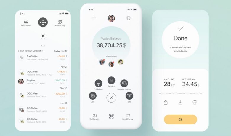
Create a sense of completion
UX guidelines for banking apps should always reinforce each step in the customer journey, from beginning to end. For example, after a customer hits the “Transact” button, the app should show a pop-up asking if they’re sure about the transaction, with a simple yes-no question. This confirmation helps to prevent accidental missteps that could be costly for both the customer and the bank. Another UX guideline is to provide feedback throughout the journey, to reassure users that their actions are being processed. This might take the form of a brief “SENDING…” animation, even if the transaction is processed instantly in real time. The animation serves as a visual cue that lets users know their transaction was successful.
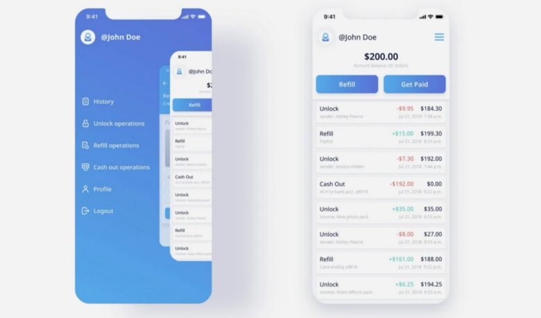
Create a detailed transaction history
A “Transaction History” menu is a must-have UX technique for banking applications according to researchers. Most people who use banking apps want to revisit past transactions for different reasons like reflecting on mistakes or gaining peace of mind. If possible, the app should also show the status of each transaction next to it. For example, whether it is being processed, has been successfully transferred, or failed. This would give users a better idea of what is happening with their money and allow them to take action if needed. Differentiating between successful and failed transactions is also critical so that users can understand why a particular transaction might have failed.
One of the key factors in designing a successful UI is prioritization. Rather than presenting all of the possible actions that a user can take, it is often more effective to focus on a few key actions that are most relevant to the user. For example, if a customer is likely to use the “Pay Bill” function monthly, it makes sense to place it prominently on the home screen. By contrast, if an action is only used infrequently, it may be better to hide it behind a menu or bury in a settings page.

Source: kms-solutions.asia
Let’s use templates and autocomplete
The application can help users speed up many transactions and decisions by automatically pulling information from users’ contact lists and past activities. This is extremely useful when users are trying to schedule something or make a purchase. In addition, the app can help users complete transactions and avoid typing errors by using past data that is saved to the phone. This is a great feature for users who want to improve their UX. By using the app, they can save time and hassle in their everyday lives.
Always write the final purchase price
The transaction flow is an important part of any UX design. Typically, the transaction flow can happen across multiple screens. This can be confusing for users and may lead to errors. However, it is best practice to summarize transaction information on one screen. With this summary screen, users will have more confidence because they know what they are doing and will be less likely to experience errors. This summary screen should include all the important information about the transaction, such as the amount, the parties involved, and the date.
Provide a great user experience in your mobile bank and you are guaranteed to get more customers. Regular users will also be grateful to you and will bring friends themselves.
