
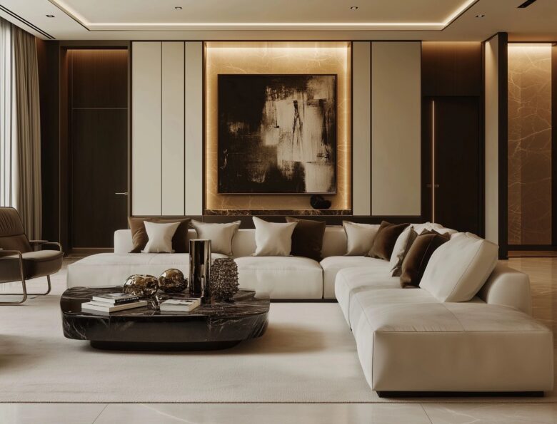
A room can contain beautiful furniture and still feel strangely uncomfortable. The sofa may be excellent, the rug expensive, and the lighting carefully chosen, yet conversation feels awkward and walking across the room requires a small obstacle course.
Good interior design begins with relationships: furniture in relation to people, furniture in relation to the room, and every visible object in relation to everything around it. Scale, circulation, and visual weight usually matter before decorative details.
For most homes, a useful order is simple. Measure the room, identify how people will use it, establish clear movement paths, choose appropriately scaled furniture, then work on visual balance. Following that sequence prevents many expensive mistakes and gives decoration a stronger foundation.
Furniture Selection Starts With Scale
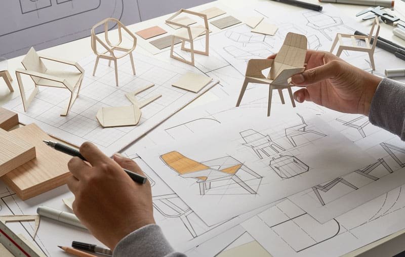
Furniture shopping very often begins with appearance. A person sees a sofa online, likes the fabric, and imagines it against the living room wall. Measurements enter the conversation later.
For professionals sourcing furniture for interior designers, dimensions, materials, and intended placement are therefore worth considering before a piece reaches the final specification.
Reversing that process produces better results.
Scale describes the size of an object in relation to its surroundings and to the human body. Arizona State University’s overview of design principles places scale and proportion among the foundations of visual composition, alongside balance, emphasis and harmony.
A large sectional can feel perfectly natural in a broad open-plan living room. Put the same sectional into a narrow apartment and its depth may consume the useful floor area even when the sofa technically fits between two walls.
Room dimensions therefore tell only part of the story. Door swings, radiators, windows, fireplaces, built-in cabinetry and walking routes reduce the area furniture can actually occupy.
Before ordering a major piece, record:
- Overall width, depth and height
- Seat height and seat depth
- Clearance required around it
- Doorway, hallway and stair dimensions
- Window-sill and radiator heights
- Space needed for drawers, cabinet doors or recliners to open
Architectural Digest recommends marking furniture footprints directly on the floor with painter’s tape before buying. Cardboard boxes can even approximate the volume of a new table or cabinet. A full-size outline often reveals problems that a product page or small floor-plan sketch hides.
Choose Furniture for the Way the Room Works
Two households can use identically sized living rooms very differently.
Someone who regularly hosts eight friends needs flexible seating and surfaces within easy reach. A household that mostly reads, watches films and keeps evenings quiet may benefit from a deep sofa, one excellent armchair and fewer occasional chairs.
Dining furniture follows similar logic. An impressive table that spends most of its life surrounded by empty chairs can dominate a modest room. An extendable table often gives the space greater flexibility because its everyday footprint remains smaller.
Material matters as well. Pale linen upholstery can look wonderful in photographs, while homes with pets, young children, or frequent dinner guests may place higher value on washable covers and durable weaves.
Glass creates less visual mass than solid timber, although fingerprints and frequent cleaning become part of daily life.
A successful purchase survives contact with ordinary Tuesday evenings.
Plan the Room Around Movement
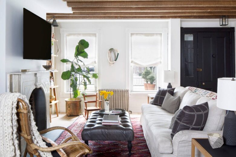
Interior designers often talk about circulation, meaning the paths people naturally follow through a space. Layout improves quickly once those routes become visible.
Look at where people enter the room and where they go next. A living room may connect a hallway with a balcony. A bedroom might contain the main route between the door, wardrobe and bathroom. Furniture placed across one of those paths creates repeated friction.
Professional designers frequently solve layout before selecting finishes. In an interview about his design process, Juan Pablo Molyneux explained that he first studies floor plans and circulation and how occupants will use a home, then develops the layout before moving into color and texture decisions.
One useful exercise requires nothing beyond paper.
Draw the room roughly to scale, add fixed features, then sketch the major walking paths. Furniture can occupy the remaining zones without forcing people into sharp turns around tables or chairs.
Start With the Largest Piece
Most rooms have an anchor.
In a bedroom, the bed usually fills that role. A dining room revolves around the table. In a living room, the sofa often establishes the main seating zone.
Place the anchor first and arrange supporting pieces around it. The approach makes proportion easier to judge because every later decision has a reference point.
Coffee tables provide a good example. Current Architectural Digest coffee-table guidance recommends roughly a foot of space around a coffee table for movement and suggests keeping its length at no more than about two-thirds of the sofa’s length.
Typical coffee-table heights fall around 16 to 18 inches, although sofa height should influence the final choice.
Exact dimensions vary with the people using the room. A family with small children may want greater clearance around sharp corners. Someone with limited mobility may require wider, simpler routes. Practical layout always responds to the occupants.
Furniture Does Not Have to Hug the Walls
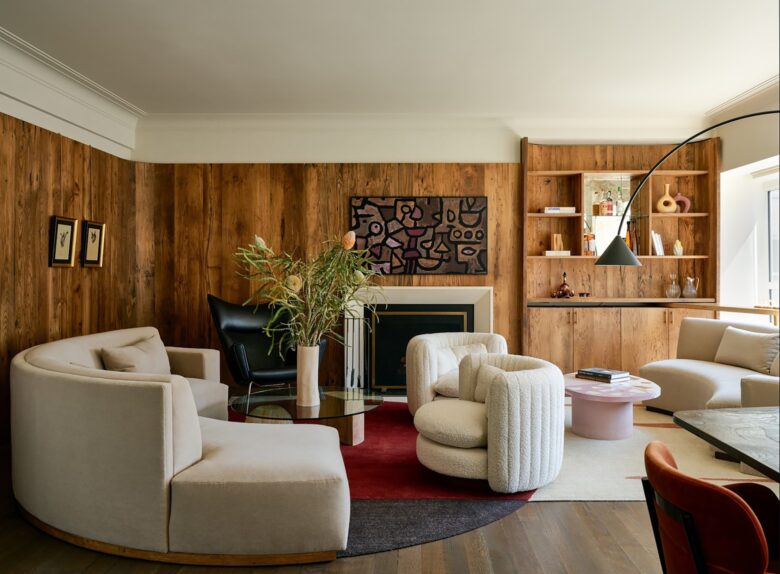
Pushing every piece against the perimeter seems like an obvious way to make a room feel larger. The result can resemble a waiting room, especially when seating ends up several metres apart.
Floating furniture creates smaller functional zones and can make conversation easier. A sofa may sit away from the wall with a console behind it.
Two chairs can angle inward toward the sofa. In an open-plan home, the back of a sectional can mark the boundary between living and dining areas without adding a physical partition.
Rugs are especially useful for defining those zones.
A rug that relates properly to the seating group helps several separate objects read as one composition. Architectural Digest designers generally favour generously sized rugs that relate clearly to surrounding furniture, with larger sizes often producing a stronger sense of depth and cohesion in smaller rooms.
The floor therefore becomes part of the layout rather than leftover space between furniture.
Visual Balance Explains Why Some Rooms Feel Settled
Physical balance involves furniture staying upright. Visual balance deals with perceived weight.
A tall dark bookcase carries considerable visual weight. So does a broad sofa, a large artwork, or a strongly patterned rug. A slim chair in a pale fabric feels lighter, even when its physical weight happens to be similar.
Design education commonly separates balance into symmetrical and asymmetrical forms, while radial arrangements form another useful category.
Oklahoma State University describesn visual balance as the distribution of visual weight and notes that differently sized elements can still create equilibrium depending on their placement.
| Type of balance | How it works | Where it often works well |
| Symmetrical | Similar visual weight mirrors across a central line | Bedrooms, fireplaces, formal living rooms |
| Asymmetrical | Different objects create comparable visual weight | Contemporary living spaces, shelves, mixed seating |
| Radial | Objects organise around a central point | Round dining tables, conversation areas, entrance halls |
Symmetry is easy to recognise. Picture a bed with matching bedside tables and lamps. The arrangement feels calm because the eye receives nearly equal information on either side.
Asymmetry has greater freedom. A substantial armchair and floor lamp on one side of a sofa might visually balance a smaller chair, side table and artwork on the other.
Matching quantities becomes unnecessary. Perceived weight is the useful measure.
Repetition Helps a Room Hold Together
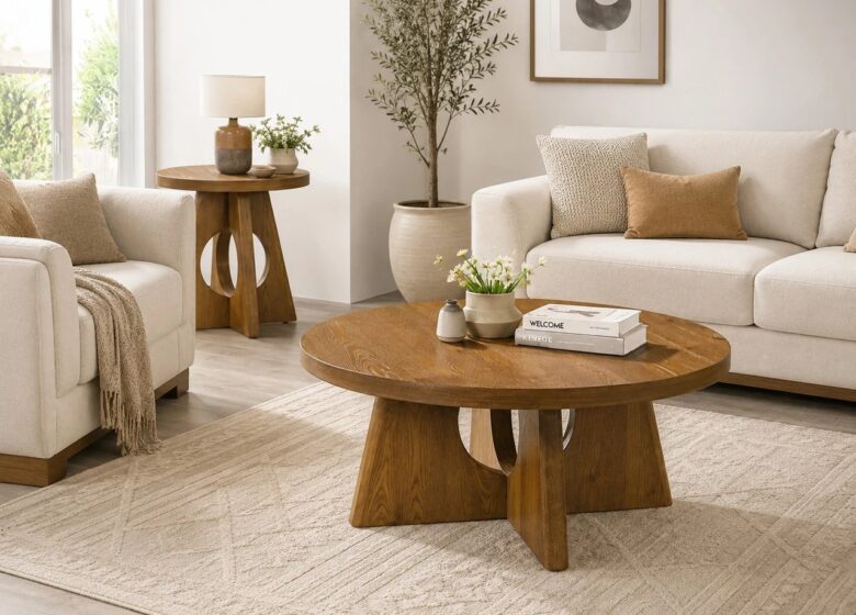
Walk through a well-designed room, and certain details often reappear quietly.
A curved chair may echo a round coffee table. Walnut from a cabinet can return in a picture frame. A muted green from an artwork may appear again in a cushion several metres away.
Designers call the effect rhythm or repetition. Repeated lines, colors, forms and textures help guide the eye through a composition. Rhythm emerges when related elements and their spacing create a sense of movement across a room.
Repetition works best with restraint. Copying the same finish onto every wooden object can make a room resemble a furniture showroom. A few related materials usually create enough connection while allowing individual pieces to retain their identity.
Historical modernists explored similar ideas intensely. The Bauhaus, founded by Walter Gropius in Weimar in 1919, taught space, color, and composition alongside practical disciplines including cabinetmaking, metalwork, and weaving. MoMA describes Bauhaus objects as using balanced geometry in pursuit of functional efficiency for modern homes and workplaces.
Marcel Breuer’s interiors offer a memorable example. MoMA records how he often worked with a limited number of component elements, allowing each rug, wall surface, or furniture piece to carry greater significance within the room.
A century later, the lesson remains useful: fewer well-related decisions can create greater visual coherence.
Give the Eye Somewhere to Rest
Every object competing for attention creates visual noise.
A room usually benefits from hierarchy. One element might lead, several others support it and quieter areas provide relief. The focal point could be architecture, art, a fireplace, a sculptural light fixture or simply a strong view through a window.
Furniture should respond accordingly. A dramatic artwork rarely needs several equally assertive objects immediately beneath it. A highly patterned sofa may work better with simpler surrounding surfaces.
Empty space plays an active role here. Leaving part of a wall bare or allowing open floor around a distinctive chair gives the eye a pause between stronger elements.
Visual balance therefore depends partly on deciding where nothing needs to happen.
Build the Room in the Right Order
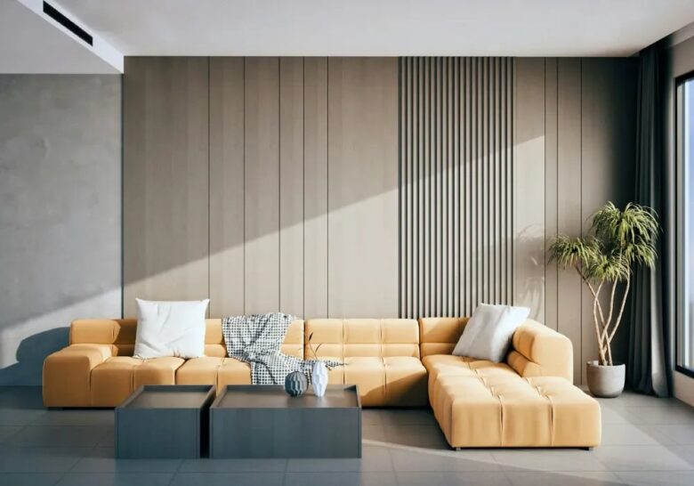
Interior design becomes easier when decisions happen in sequence.
Begin with measurements and daily routines. Establish circulation and place the largest furniture. Check clearances in real scale with tape or cardboard. Add supporting pieces, then evaluate visual weight from several viewpoints, including the doorway.
Only afterward should smaller decorative objects carry much influence.
Rooms rarely fail because someone chose the wrong cushion. Problems usually begin earlier, with a sofa that overwhelms the space, a dining table that blocks movement, or several large objects competing for attention.
Strong interiors feel natural because scale, layout, and balance quietly support daily life. When those fundamentals work, personal style has room to become far more expressive.