The logos are designed to intrigue you but usually, they are carrying a secret message that penetrates your subconscious mind. Of course, these are all different marketing strategies and the companies are only using psychology to their advantage. Without further ado, here are 24 logos with hidden images.
Contents
- FedEX Express
- NBC
- Goodwill
- Big Ten Conference
- Baskin Robbins
- ED
- Carrefour
- Mammoth
- Northwest Airlines
- The Pittsburgh Zoo
- Sun Microsystems
- The Atlanta Falcons
- LG
- Via Rail Canada
- Milwaukee Brewers
- Tostitos
- Sony Vaio
- London Orchestra
- Hershey’s Kisses
- Hope for African Children Initiative
- Toblerone
- Tour de France
- Washington State University
- Roxy
FedEX Express
Even though it seems like a regular logo, you need to take a better look. Between the E and the X is a white space shaped in an arrow. This signifies speed and precision.
NBC
With the NBC, spotting to an image is not that difficult. If you look closely and think outside the box, you will see a peacock. It is hard to miss, is it not?
Goodwill
The smiley face of Goodwill. But did you notice the second one, the same as the first? See how the letter g resembles the logo.
Big Ten Conference
Sure, now there are more than 10 schools in the Big 10. However, when Penn State joined in 1990, they were the 11 state. Instead of changing the entire logo, they inserted the number underneath the letter T. Can you spot it?
Baskin Robbins
Baskin Robbins is known around the United States for 31 flavors, a different flavor each day. Even if you haven’t known that, you can always figure out the number from the logo. Just look closely at the letters. These are pretty obvious.
ED
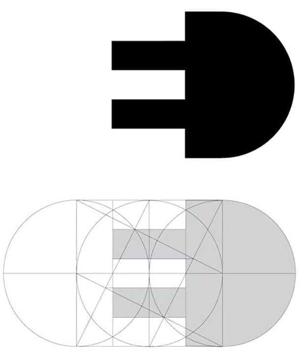
This logo is designed by Gianni Bortolotti for the Italian electric company called Elettro Domestici. It quickly became popular in the world design community.
Carrefour
When this name is translated to English, it means Intersection. And if you take a glance, you will notice that the C letter is not the only one featured. Do you see the two arrows pointing in the opposite directions?
Mammoth
This is one of the quite clever logos. Used for the popular ski resort in California, one can see an M, a mammoth, a mountain and a ski trail as well!
Northwest Airlines
The old logo of the Northwest Airlines was brilliant. Not only are the letters N and W constructed from the same shape, but there is also another thing to pay attention to. Yes, it is the compass that points in one specific direction. Can you guess which one?
The Pittsburgh Zoo
Do you plan to visit the zoo in Pittsburgh with your family? Maybe this isn’t the best zoo in the country, but they certainly have one of the best logos. It shouldn’t be difficult to spot a gorilla and a lion looking at each other under that tree.
Sun Microsystems
Before it was acquired by Oracle in 2010, Sun had a recognizable logo all over the world. Even though it doesn’t longer exist, it is still considered as one of the best logo designs. Vaughan Pratt is the man behind it and the word Sun can be read from any direction!
The Atlanta Falcons
In case you love football, this one should be no mystery to you. The Atlanta Falcons have a cool looking bird, which is ready to dive down and beat their opponents. Moreover, this bird is in the shape of the letter F.
LG
LG logo is familiar to everyone. The two letter, L and G are placed in a way to form a smiley that winks to the buyers. This sends tons of messages and the most important one is that you will be happy with the product.
Via Rail Canada
If you have ever gone north across the border, you must have seen this logo somewhere. They yellow letters obviously stand for VIA, but they also show a railroad. Quite unique, don’t you think?
Milwaukee Brewers
The Milwaukee Brewers might have the best logo in the baseball league out of all teams. The M and B letters are clearly visible, but the logo also shows the glow with the ball caught in the middle of it. Whoever created this one, they did a fantastic job.
Tostitos
Tostitos chips and dips will always be a great snack. But besides producing a fantastic food, this company has the logo to brag about. The fun part happens around the letter i, with two men next to it as Ts. They are eating the Tostitos and obviously enjoying themselves.
Sony Vaio
This is one of the logos you must have seen somewhere. And like any other logos on this page here, it has a secret to show the world. Each letter in this logo has a separate role. The first two are forming an analog signal, whereas the last two are binary digits 1 and 0. How clever is this?
London Orchestra
What is this, just a line? How this falls into the category of the best logos with hidden messages? Sure L and O are written in a creative way, but is there anything else to this logo that a naked eye cannot see. Upon further inspection, we managed to get a glimpse of the orchestra conductor. That’s fine, take your time.
Hershey’s Kisses
In order to see the hidden message this logo brings, you will have to find a large example. Next time you run into Hershey’s Kisses pay attention to the space between the K and I. Who knows what you may find there.
Hope for African Children Initiative
The non-profit organization boasts a logo that can easily beat the logos of the other NGOs. The white surface is the African continent – keep looking at it, because orange and red are not mere oceans. These are a child and his guardian.
Toblerone
The candy we have all eaten at least once in a lifetime. Famous for the special design and sweet taste, the hidden message in the Toblerone logo is hard to spot, so don’t be hard on yourself if you missed it. This appeared in the city of Bern, Switzerland, which is an area associated with bears. What do you see when you look at that mountain?
Tour de France
The famous bicycle race in the world takes place in France, a gorgeous European country. And the logo of this competition is something special. The letter O and the white circle are the wheels, the letter U the seat and R marks the rider. This one is just fantastic!
Washington State University
The Cougars stepped up when it comes to their logo. The three letter acronym of is actually showing their mascot. All of the students of this university must be proud because they have one of the best logos.
Roxy
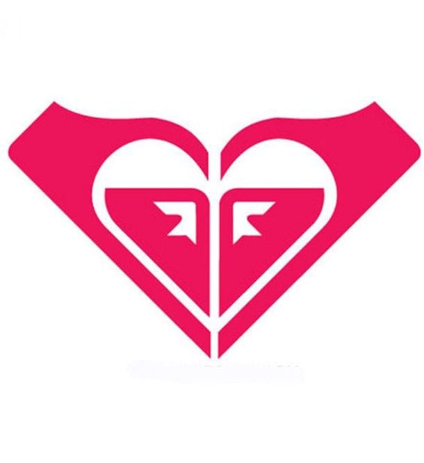
With Roxy, Quicksilver wanted to attract female surfers. It was a difficult marketing campaign and a gutsy move but it worked. And the heart-shaped logo is derived from two back to back Quicksilver logos and it is partially responsible for the job well done.
Here, we showcased 24 logos with hidden images, messages or writings. Now, your time has come. Let us know which one of these logos is your favorite. Also, did we forget to include anything? Feel free to add to this list. I bet after reading this, you will be looking at the logos from a different perspective.
If you need to make your logo, visit Logomyway.com. This emblem generator creates some great looking designs. It’s free to make your logo and only takes about 5 to 10 minutes, but you will need to pay a fee to download the logo and start using it. Enter your company name and simply select the logo you like. You can edit by changing colors, text, fonts, and shapes. With this logo creator, you can download the high-resolution files instantly. All of their logo templates are created by professional designers from all over the world.
