Web design is a branch of design that deals with the process of creating the aesthetics of your web pages. Usually, a web interface is designed according to the colors of the product or service it provides, and most often the colors of the interface design itself come from the colors of the brand logo. And as you have already mentioned by visiting different websites, the Interfaces were all set on light backgrounds. That is, until recently, in 2019 a whole new trend emerged – the dark mode
Just three years later, it’s an increasingly common sight in digital environments. Is dark mode becoming a standard feature and should you implement it in your app or website? In order to decide you need a couple of basic information, and some pros and cons to help you make a conscious decision. So, read what we have prepared in this article.
Contents
What is dark mode
Dark mode can be understood as a kind of inverted design from the one we are used to. In other words, dark mode uses light text, usually white or gray, on a black, or some other dark background. The idea behind it is to reduce the emitted light of the device while maintaining sufficient contrast to enable content visibility and readability.
The popularity of the dark mode

Source: sea.mashable.com
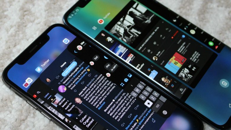
Its appearance was announced, as we said, back in 2019, as it was something spectacular. However, the dark mode is nothing new. Moreover, the first screens were in dark mode! The CRT technology of the time was not powerful enough to illuminate the entire screen for a long time, so the simpler option was to display the content with light and to have the background be black. Windows Phone 7 from 2010 is considered to be the first device with a dark mode in modern times. Since then, more and more big companies like Facebook, Reddit, Twitter, YouTube, and the like have embraced and introduced it. Now it is a choice you can make on any device or social media tool you use.
Should it be implemented on the web?
If you want to please all users and visitors of your site, it would be good to include this option on your site. With both modes, it is desirable to implement an option to quickly switch between light and dark modes of operation, in order to allow each user to easily customize the page. Additionally, you can save battery for your visitors. The benefit you have, in addition to satisfied users, is a greater opportunity to play with the design of the site. You can experiment with more colors, the different appearance of elements, and new features. However, the implementation of dark mode carries with it certain risks. You have to make sure that the color of the font you use will work for you and be legible in all light levels. An additional trap you can fall into is to stray too far from your color scheme and lose some of your identity.
It is a very useful and desirable feature that you can implement on your website. It is very important to implement it in the correct way, because otherwise the quality of the entire site, as well as the identity of your brand, can be easily jeopardized. If you want your website to follow trends and be fully adapted to your visitors, or if you have questions about the implementation of dark mode, visit https://paularoloye.com/.
What about the pros and cons?

Source: medium.com
Well, here’s a list to help you decide.
Pros
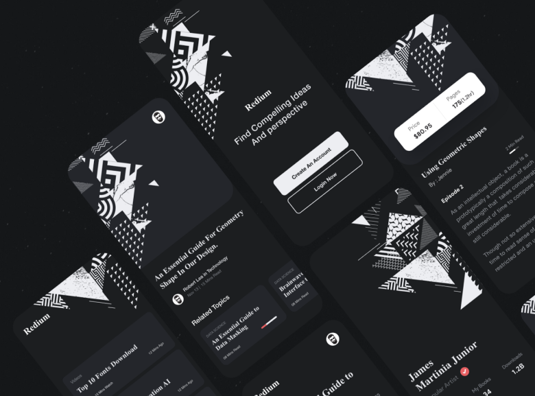
When you design your website, and for example, sell things on it, you want to catch the attention of the visitor. In this case, the dark mode helps draw attention to the content. Additionally, it keeps the visitors focused. How? It’s in human nature to focus easier on brighter areas, and dark background makes the bright look brighter.
For those who are forced to look at the screen for a longer period of time, dark comes as much more pleasant to the eye. There’s not much light to burden the eyes, and the focus is easier. Generally, people who experience vision issues can find it much more convenient to use this mode, as eyestrain is reduced.
Everything created in this mode somehow looks premium, more sophisticated, and very artistic. When used alongside light, the contrast is much more increased.
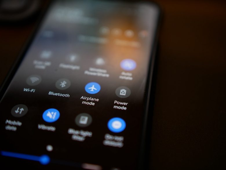
Increased battery life. Everyone struggles with this sooner or later. So, having an option to switch to a mode that will save up the energy of your device, is a very convenient thing to have.
When you are in an environment with not that much light, it could be difficult and burdening to read through stuff you find online. The dark mode comes very helpfully here, as well.
Cons
It’s not the best choice for reading. If you have too much information people have to read on your site, and the letters are smaller, this mode might not be the best idea for you. Readers’ eyes will have difficulties because the bright letters will appear to be larger than they are, and glowing. Hence, people will experience difficulties reading.

Source: uxdesign.cc
Final word
Each of us perceives the world around us differently. If we take an example, we can notice that we all have our own standards of beauty. Whether it’s fashion, architecture, or a seemingly ordinary website – everything around us is actually designed. However, the task of each of these designers is to provoke a reaction from people as critics with their own style. When we talk about web design, it seems to be very simple because the pages are mostly similar in structure, but each one is different in aesthetic style and just like that – special. It presents the brand in a way that attracts consumers with graphic elements, i.e. illustrations, photographs, and photo manipulation of products. But what impact the dark mode of the web interface actually has on the user’s perception? It is yet to be seen.
