When an organization develops its brand, the concentration is more on websites, logos, and such. These are customer-facing elements, and that’s why businesses focus on them. But what most business organizations overlook is the flag.
Custom flags draw the attention of your prospects while reinforcing your brand. Some business owners find it intimidating to design their custom flag; others worry that they can’t afford the perfect designer for it. Flag designing is not always easy, but it is something you can try doing.
Contents
What do you consider when designing custom flags?

Source: Pinterest.com
Keep the flags simple
The custom design doesn’t have to be complicated for it to work. When designing the custom flag, there is a temptation to design a banner representing your business to the whole world and fully communicating your beliefs.
The problem with that is you’ll be asking too much from a single cloth. A custom flag isn’t a manifesto where you capture every thought you have about your business enterprise. It’s a symbol, and it has to be simple. Instead of cramming everything to your flag, look at the message that will capture your business purpose so they know what to expect when prospects see it. It could even be about a single product that you want to promote. That way, people can easily see the solution you’re offering and if it’s something they would love to have. More different flags, you can find at https://ultimateflags.com/.
Use a large font that is legible from far; your logo should also be conspicuous, and choose a color that will make the message prominent.
Avoid text
Text can be challenging to read and understand. Try reading some of the banners by other organizations and get the experience of the ones with a text. You’re most likely going to have a problem reading text as opposed to acronyms or pictures. All you need is something that the audience will capture the first time they see your flag. Think of the flags used by the UN first. You’ll see the word UN from far, and you know, that is the United Nations – without struggle. If you think of using text, be sure you’ve something legible from far; letters’ size should be large enough.

Source: theflagshop.co.uk
Color
Mixing colors is tricky but a powerful tool when designing banners or flags—people associate colors with feelings. For instance, green is associated with nature; purple is a color of royalty borrowed from kings in western culture. These associations with colors are essential when deciding on the color to use when designing your custom flags. The danger here is when you use a color that doesn’t represent what you’re selling to the world- thus sending the wrong message. That can be pretty counterproductive. For better effect, use the colors your business uses for marketing- that way, you know there’s consistency in what you tell out there and what people can see on the flag.
How do you use custom flags for branding?
The digital influence today can easily lure you to believing that traditional advertising doesn’t work anymore. But before you buy the half-truth, drive down the busy streets, and what will most likely attract you are the signposts and custom flags for different companies. The custom flags carry the same weight as those highly invested marketing campaigns and although the digital methods of advertising seem to be gaining traction, check out your business streams, and you’ll most likely realize from 2008, over 20% of your business has come from flags and banners.

Source: one-economy.com
Why custom flags?
They are a one-time cost and continuing return
When introducing a new business in the market, the digital marketing strategies are great in getting the word out there. The message gets viral, and you can reach out to millions of prospects in a short span. But you have to keep paying for fresh content and the daily tweaks so the content and message remain fresh and attractive. You also have to keep optimizing the content as technology grows, and that means more money.
With custom flags and banners, you will only incur the cost of design and putting them in that strategic place. From then, you have it advertising on 24hr basis, and you pay nothing to keep it there. You don’t have to keep signing those contracts to keep the online ads running- the flags will continue bringing customers as long as they are perfectly designed and positioned.
Two factors come into play when selecting custom flags; size and type. You don’t have to use the standard rectangle shape when doing custom flags. You can choose any shape that fits your brand as long as the message is clear and appealing to the audience.

Source: gettysburgflag.com
Choices
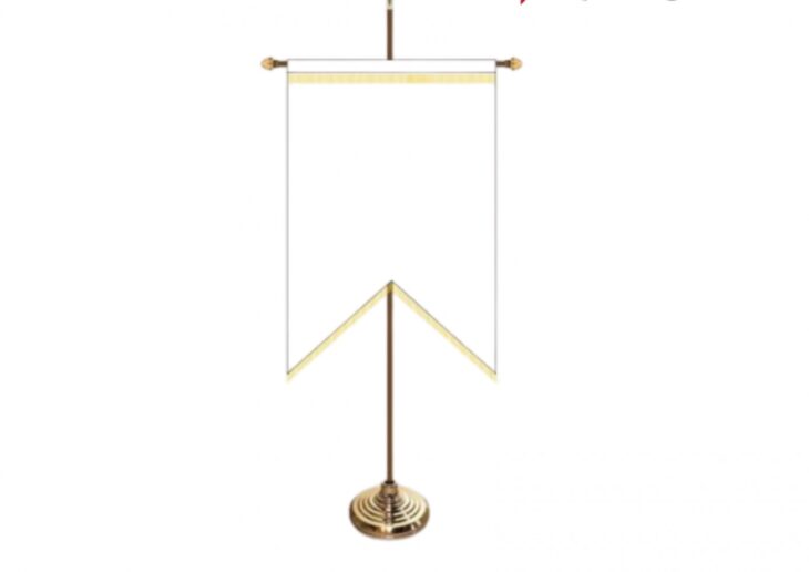
Gonfalon shape is a five-point shape usually suspended from a crossbar, popular for schools and colleges. This is usually perfect when advertising back-to-school promotions. It’s a shape that is common with matters school.
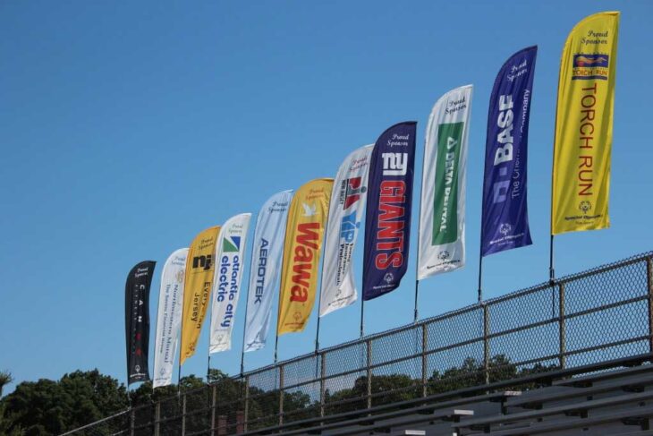
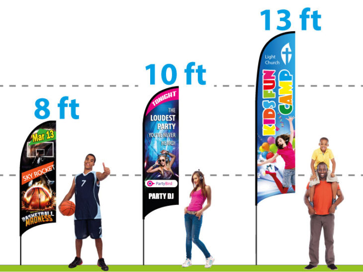
Feather shape: This is tall and vertical and makes it ideal for promotion. You will see most of these in outdoor settings, and they carry complementary messages.
Pennant shape: This shape on its own, even without inscriptions on it, will give you that sporty rah-rah feel. They are perfect when stringing in the outside of buildings and the periphery of parking lots when doing major events like launches. When in your business color scheme, a pennant shape can be an excellent investment that draws vision attention any time you have a significant sale or some other promotional event.
How do you make your custom flags effective?
The most important thing you have to keep in your mind is the purpose of the custom flag. Think about its visibility- where it’s placed, how the traffic is, and what kind of people you are targeting. Perfect placement will make it easy for many people to see and remember; the more people see your custom flag, the more they get attracted to your business.
Most importantly, the thing about the design company you choose- look for someone with experience in designing custom flags and banners like lushbanners.com , one who will deliver quality work within a short span and at competitive rates; after all, custom flags should give you value for your investment.
