Whether you’ve already been through 2024’s web design trends or not, one thing is sure: geometry is going to be important for many web designers and web design companies if they want to stay afloat.
When more and more companies move to the Internet in the modern market environment, having a relevant and effective website is a critical necessity. Therefore, if you are a self-employed web designer or are part of a web design agency, you may consider yourself an essential creative worker. Either way, the modern market is ruthless, and if you can’t provide the best services, you may end up broke. This is why Bay Area web design companies and web designers are constantly looking for new and more efficient solutions for their customers. But when it comes to geometry, it’s not exactly new. It’s been around forever. You can find examples here.
Geometry has a particularly inherent and familiar logic and order. It is universal to human perception, so it reaches us all on an intense level. Why, then, not leverage this fact for better use? We would venture as far as to say you already implement geometry in your designs, even if you do not recognize it on a conscious level. Let’s explore this effective design trend with a deeper dive into its details.
Contents
Why Is Geometry Essential for Web Design?
To broadly define geometry, we would designate it as a study of the properties and measurements and the correlation between lines, points, angles, solids, and surfaces, a concept not all that dissimilar to web design. Measurements assure that you are working within the correct spatial parameters, properties, or attributes of used elements give various page components life, and relationships assist in determining an intra-element hierarchy. So as a web designer, all of these things are already built into the very fabric of your profession. What you want to think more deeply about is why this is done.

Source: quasa.io
How Is Geometry Used in Web Design?
First, let’s address geometry’s most essential element: a point. These are singular spots utilized in web design to drive focus to a particular area, such as in the form of call-to-action buttons that draw the visitor’s attention as notable focal points of the page.
There will be multiple points on your website, but it’s their relationship to one another that is what makes their coexistence stand out. The relationship between two points is formed by bridging the gap between them (geometrically speaking) with a line. One button should draw a linear relationship to another controller in web design terms, generating more proper attention for both.
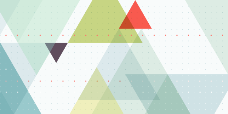
Lastly, there are shapes (squares, circles, triangles, etc.) that are likely the first things that come to mind when we invoke the term “geometry” and shapes contain their attributes and can be very simple or highly complex.
While geometrical shapes are basic and easily recognizable by anyone, applying them in a web design setting does not have to be quite simplistic. They can be used in both foreground or background of designs and can either be empty or filled (partially or fully). They can be stationary fixtures in the display or possess animated effects. They are also commonly used for transitions.
Shapes are used for plotting out and planning elements within designs and can be applied in a slew of dimensions, including one-dimensional (lines), two-dimensional (flat shapes), or three-dimensional (shapes with depth that exist across multiple planes). Prevalent forms are used in web design for logos, icons, photos, and fonts as well.
Some are often convinced that the simplicity of geometric shapes does not allow much creative bandwidth. Still, once the meaning behind these shapes is understood, their utilization can result in a vast array of innovative applications.

Source: veerle.duoh.com
Benefits of Taking Advantage of Geometry in Web Design
Let’s now discuss why you stand to benefit from an application of geometric shapes in web design.
- Lines and shapes promote a feeling of balance and symmetry, yielding more straightforward navigation around the website.
- There is a remarkably calming effect to the organization of various elements distributed inside of shapes, promoting the sense of cleanliness and order.
- Geometry helps establish intuitive consistency, which immediately trains website visitors to associate featured elements in a particular manner.
- The possibilities are endless from a creative aspect when considering that geometric shapes can either be applied on their own or in tandem with others and be outlined, filled in, or colored.
- Geometric shapes can help feature the essential aspects of your site (the content), particularly highlighted flair, while rendering everything around it into a more plain background.
- Subtle use of geometric shapes lends itself nicely to minimalistic designs.
- Since most designs begin with a grid-style format (typically based on rectangles, squares, and triangles), the use of geometric shapes is essentially the basis for the underlying structure of nearly every design.
On top of all of that, every geometric shape has a particular meaning or feel when used in web design. Therefore, mastering the psychology behind these meanings gives the designer a massive advantage in effectively using these geometric shapes to convey particular messages and invoking the desired emotional responses.
Rectangles and Squares
Rectangles and squares exude proper uniformity and symmetry with their four right angles and clean, stable, parallel sides. Because of their clearly and sharply defined boundaries, these shapes are the most formal and linked to the sense of traditionalism, stability, reliability, and honesty. For this reason, these geometric shapes are typically the underlying structures of websites and are commonly used for organizing text and call-to-action elements.
Circles

Source: pumpkinwebdesign.com
Commonly used for logos or icons and to highlight those elements that necessitate visitor attention, circles are a powerful shape to application in design. They represent perpetual motion, unity, harmony, and wholeness.
Triangles

Source: awwwards.com
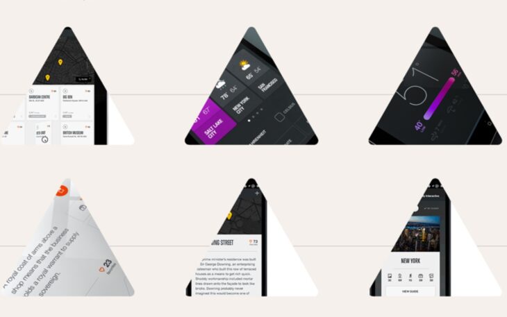
While triangles share the stable-sided base attribute with rectangles and squares, their meaning is akin to evoking a feeling of motion, progression, and direction as the shape naturally shaped like an arrowhead to point the way. For this reason, triangles are great for use in navigation, granting clear directional cues in menus, page traversing, and indicators for where to find additional information.
Rhombuses

Source: pinterest.com
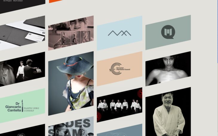
Rhombuses are less commonly utilized in web design, so they leave a powerful impression when they are. While the rhombus features parallel lines and equal sides, its slanted shape yields a sense of movement, similar to that evoked by triangles. This attribute makes rhombuses great for backgrounds as they induce a natural flow of progression from one foreground element to another.
Hexagons

Source: pixabay.com
While rare in web design, the use of hexagons is increasing. This is primarily due to the hexagonal ability to communicate a sense of unity.
Of course, other polygons are used in web design, as well as natural and abstract shapes, but the above geometric shapes are the most commonly used because they are the most effective in terms of evoking a particular effect, meaning, or emotion from the visitor.
Conclusion
Geometry is all around us in our daily life, found in everything, including nature (the hexagonal design of bees; honeycomb, for instance), so moving them from the natural setting to a digital one is a very logical web design step. They are easily recognizable, regardless of their applied subtlety. They carry powerfully symbolic characteristics that can speak volumes about a website without necessitating the use of any type of rhetoric.
If your web design company (or you) is looking for new ways of addressing visual and graphic solutions, take notice of the things described above. It’s not about introducing a new technique into your work but rather about using an ages-old method with a fresh perspective.
