If your app doesn’t give users what they expected before they downloaded it, they will stop using it and not return it. This is something that you want to avoid, and you can do this by following the best design practices and avoiding common design mistakes.
It can be challenging to design a mobile app that doesn’t have any problems that the users will have to deal with. All of them have bugs, and these need to be found and removed without delay. Otherwise, the app will be annoying to use, and users will leave and look for a different one to use.
This article will discuss the best design practices that you need to follow when your app is being developed and the common mistakes you need to be aware of before starting development.

Source: Medium.com
Contents
5 Best Design Practices That You Need To Know About
We will start with some of the best design practices you need to use when developing your app. These will increase the chances of success for your app and help it give users precisely what they are expecting.
1. Make Sure Your Design Is Consistent
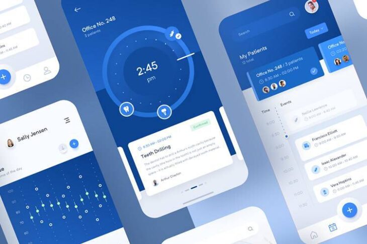
Your app’s design needs to be consistent throughout the entire app. This will make sure that the user has a great experience when using it and improves their chances of coming back to continue using it. A consistent design for your mobile app will remove any confusion that users could have, enhancing usability.
Source: Pinterest.com
2. Decrease The Number Of Actions Required To Achieve The User’s Goal
You need to make sure your app is simple to use. Reduce the number of steps that users need to take to complete their goal. You can do this by making forms shorter, letting the app automatically fill in forms if the user has used the same information before, and add one-click features. This will make it more usable.
3. Declutter The User Interface
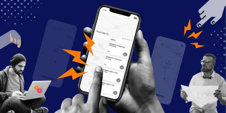
Remove anything that isn’t important. Users do not like distractions, and they want to accomplish their goals instantly. If the UI has anything that the user doesn’t need to complete their goal, get rid of it. Just keep what is needed and nothing else.
Source: iteratorshq.com
4. Use Familiarity
You don’t want users to have to learn how to use your app. It should be intuitive from the start. Users should be able to start using it once it has been downloaded, and they should be able to do this easily. You can add familiarity to your app by using standardized icons and layouts.
5. Readable Font Styles And Sizes
The typography used for your mobile app should be easy to read. Users should not need to strain their eyes when trying to read the text displayed on the screen. Sans-serif fonts are easier to read, especially on lower resolution screens. Make sure to keep the typography consistent throughout the entire app.

Source: design.google
3 Common Mobile App Design Mistakes That You Need To Know About
These design mistakes are made by apps all the time, and they lead to its failing. These mistakes can be avoided by simply knowing what they are before the development of your app.
1. A Bad First Impression
The first time that a user opens your app and starts using it is the most important. This is when they will decide if they like it and what to keep using it, or if they’ll leave it and find a different one. The first impression that your app leaves is essential, and you need to do everything you can to leave a great first impression.
Testing it thoroughly before starting development will help you make a more significant first impression. Asking the users who are trying your app about their first impression and what feedback they have will help you improve the app and make the best first impression you can. The best app design agencies will tell you how important first impressions are; if you are not sure you know how to make a great one, then hire a mobile app firm to help you.

Source: forbes.com
2. Cramming Design Features Into Your App
This is one of the most common mistakes that is made when developing apps. People think that the more features an app has, the greater and more liked it will be. This is not true. Do not add in new features just because you can. This will confuse users and decrease the usability of the app.
Add a few features to your app, and no more. You only need the features that will help users achieve their goals; anything else is not essential. If you want to add more features, then you can do that later. These new features should still be something that users need and are asking for. Look at the feedback that users give and add features that will help the users have a more incredible experience.
3. Inconsistent Design
Keep the design consistent throughout your app. This has already been discussed in this article, but it was mentioned again to emphasize how many people make this mistake and how many apps fail. Ensure the app’s design is consistent; this should be one of the main things that you focus on when it is being developed. The best app designing companies know the importance of this design principle, and they make sure to use it in every app they develop.

Source: topnet.com.my
Make sure that all design elements like buttons that look the same also do the same thing. If the same button performs different actions, this will confuse users and make the mobile app less usable. If you have difficulty creating a consistent design for your mobile app, hire a design company to help you. Click here to see work examples of such agencies.
This is one of the most crucial design principles and should be used in every part of your mobile app’s design.
