Excel is widely used, especially at your workplace. It allows you to create tables that are well-organized, organize charts and do all kinds of wonders. However, Excel is not easy to manipulate with, especially if you are a beginner. Also, you can always up your game and become more efficient in this program by attending Miami Excel Classes. For all of those looking to improve their number of skills here are eight new Excel 2016 features that you should know of.
The “Tell Me” Box
It is the most obvious upgrade, and it immediately makes you wonder why it hasn’t been here all the time. It was hard to find your favorite tools, but that has become a piece of cake with the new “Tell Me” box. It is a handy shortcut, and you can access the tools quickly, without wasting time.

image source: infoworld.com
Search Field – PivotTables
In case you are dealing with large data sets and with numerous fields on a day-to-day basis, your life has just become easier! A search bar has been added to PivotTables, providing easier access to what you want to find.
Data Grouping – PivotTables
Previously, the Excel PivotTables registered the dates individually, but it all changes now with the new feature. From now on, Excel 2016 will group the dates automatically into Years, Quarters and Months. This is much more manageable, and you can even delve deeper by using the + option that will expand the grouping.
New Charts
According to Microsoft, the new charts haven’t refreshed Excel since 1997. It was high time that had changed. Excel 2016 comes with six new chart types, and each has a special use and purpose. All you have to do is find the one that suits your needs!
Histograms and Pareto Charts
Histograms are used to compare the frequencies, such as the sales of particular produces. You can use this data to up your game. They are not based on categories but values, but if you want the categories to be seen, it can be done with the new feature called Pareto Chart. It sorts out the frequencies and adds a cumulative percentage line that showcases trends.

image source: professor-excel.com
Waterfall Charts
In case you want to measure something from start to end, waterfall charts will do that for you. They are ideal for plotting financial data such as a cash flow over a period of time. In that case, for instance, your opening balance is displayed, the progression through different stages and your closing balance. Waterfall charts can be used for some other purposes as well.
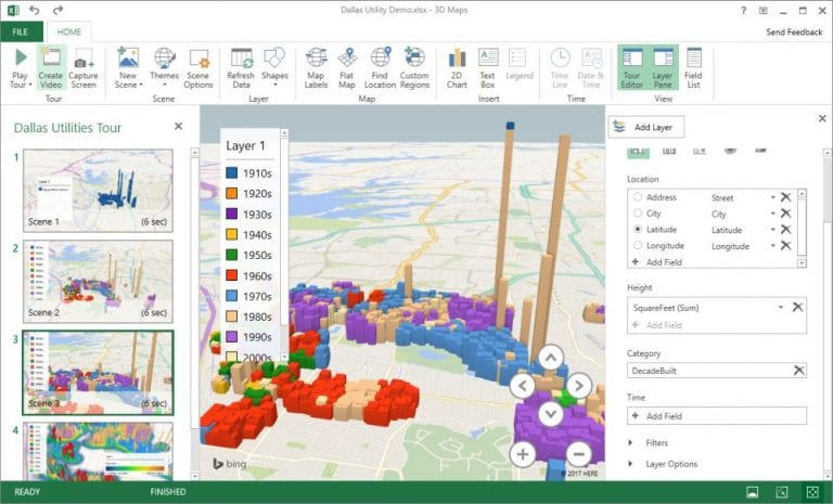
3D Data Map
The 3D data map could have been used with Excel 2013 when it was available as an add-in. However, this is now a standard feature, and this chart is essential when you are analyzing data with a global span. Locational data needs to be used here as well, which is obvious, but this chart will provide users with a map of the world with bars or columns in the locations with fields attached.
Get and Transform
A feature called Get and Transform was also an add-in, but in Excel 2016 it becomes standardized. It allows you to import data from various sources. In the past, you could have updated data from a Comma Separated Values file or an Excel workbook, but the new feature adds options such as Facebook and Salesforce as well as some other programs and packages.
All of this with the addition of some other excel features can be mastered at Excel classes in Miami. It is an efficient and time-saving way that guarantees you to improve your skills.
