You can’t run a long-term website with the same design as in 2010, because the technology is going further, and there are a lot of upgrades you have to do, so your site can be accessible, recognizable, and easy to navigate. Also, the shoppers define the changes you need to do. As your offer grows, you need more categories and more predictable navigation through them. Regular improvements should be a part of your annual marketing strategy. So, you have to follow every step your competition takes, track down the improvements the market requires, and work on your website to be more user-friendly for the customers. This task can be overwhelming at first and to make sure you do everything correctly we’d recommend you to hire experts from the Australian Internet Advertising Agency called AIAD.
Since 2024, a lot of people have dedicated themselves to online shopping, they want the best possible experience, great service, delivery, and of course, quality products. But, what’s really needed is for the website to be intuitive and easy to navigate, so even the people who aren’t into technology can order the goods by themselves.
Even when you think everything is well, there are some signs that may show you the need for smaller or bigger improvements, including:
Contents
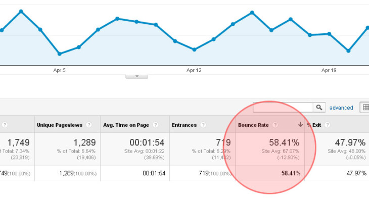
1. Increased bounce rate

Source: OuterBox
Bounce rate is an important data metrics, that shows us how many people leave the website after they click the link. When you place an ad on social media, you expect that the customers will use it to navigate through the categories, but what happens when it loads too slow, or it’s too overwhelming? They leave. Yes! And they forgot they’ve ever visited your website. You can’t expect that everyone will like your eCommerce site, but surely you don’t want everyone to leave without checking what else is there. Maybe your design is overwhelming, or boring, or even unattractive. Maybe it’s very slow and they don’t have time to wait for all the content to load. Even if they give it a chance, the poor content can change their mind. In this business, appearance and beauty are everything, so don’t underestimate their importance.
2. A lot of visits and a little purchase

Source: cyclonewebz.com
This metrics is known as conversion drop. You can track a lot of visitors on your website, but they are leaving it without buying anything. There are plenty of reasons why they are doing that. For example, they fill up their virtual basket and wait for the salary to purchase the products. Or, they are comparing your prices with other sellers and similar products, which is also fine. But, don’t exclude the possibility that something is turning them off. Diagnose the website, check if everything works nicely, and compare visitors’ behavior. Maybe the payment options don’t work for them, or there are boring popups that get them nervous. Learn more about the trends in digital marketing and apply them to your website.
3. The design isn’t compatible with the brand

Woman shopping online
This is also very common since many companies run websites just to have them. But, since the beginning of the pandemic, we saw how important are functional websites, that provide complete service to the customers, without making them leave their homes. A lot of people will judge your brand based on the appearance of your website. We know that most of the strategies are dedicated to the social media presence, but you shouldn’t limit yourself to them. Invest in your eCommerce website, and put your corporate colors, designs, logos, and other elements associated with the brand. That’s how you make it recognizable, and they know who you are, just by simply watching over the page.
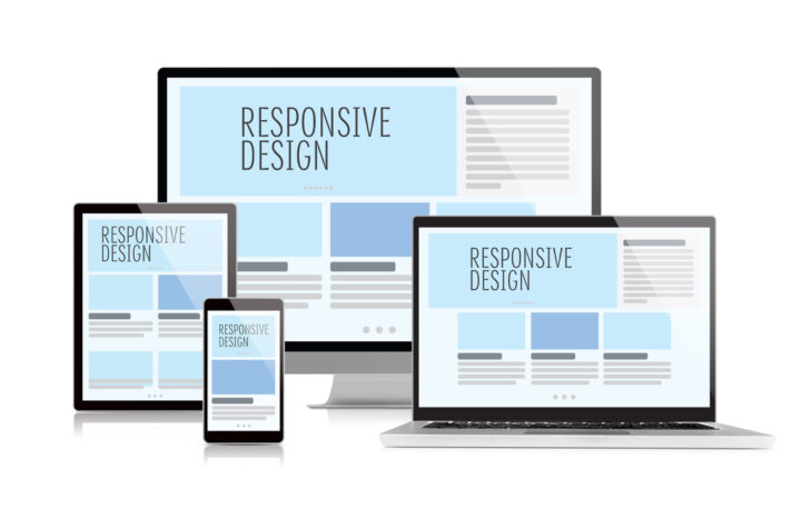
4. You don’t have a responsive design

Source: enyosolutions.com
Responsive design is a must in 2024. And if you don’t have a mobile version for your website you have to do it immediately. Today, we all use our smartphones more than ever, and we all want a smooth experience with every website we visit. Many people shop while they are on a bus, or after they finish with work and see what they need. So, we suggest you pay more attention to the mobile version, or at least a responsive design of your desktop website. Some eCommerce shops even have apps, to improve the overall experience of the customers.
5. It loads really slow

Source: halfstudiosigns
An average website needs less than one second to load, or less than three seconds if it needs to load multimedia content. But, if the customer waits longer than that, they will leave it before it’s completely loaded. Every few months you have to diagnose the performance and run some basic tests. Slow loading is a big turn-off, even when you have the best possible products and the most beautiful design. So, if the customers wait too long, they will find another store to shop from, and they will forget you exist.
6. Your website is too old

Source: liveadmins.com
If you run an online store, you probably put all the new products in the categories, but have you ever been to your homepage? How does it look? Remove the old content that isn’t relevant right now. People are often confused and may want some service you don’t provide now. So, adapt some modern and responsive design, delete all the information that isn’t relevant now, and always update the content as needed. That’s what they are looking for – a pleasant website with all the available products listed, transparent pricing, and easy navigation. Nothing less, nothing more.
Knowing all of these struggles, you probably realize that you can’t maintain the whole thing by yourself, and you need a team for that. We know it’s a huge expense for a company in a time of global health and economic crisis, but consider it as an investment that will bring a lot of profit later.
It’s not on you to decide if it’s nice enough, or functional. You must listen to the opinion of those who are the most important chain in your business – the customers and their overall experience with your service. So, don’t waste your time, and diagnose your website today, to see what do you have to improve.
