Exchanging business cards is a great way to make a good and lasting impression for you and your business. It will most certainly strengthen your branding, help you stay top of mind, and it will help people remember who you actually are and what your business is about. However, not all business cards are equal. If you want your card to have a good first impression, you will need to get creative.
Here are five ways on how you could make your business card more creative in order to leave a good impression:
1. Unique typography – in order to have a creative business card, try using bold and cursive fonts or an interesting layout. The whole point of it is to share some information. Whether it is your brand name, the address of your office, or your personal contact information, you will need to include text. To have a custom-designed font or a unique typography scale will make a lasting impression.

source: decolore.net
2. Minimalist design – when designing something, less is often more. Taking a minimalistic approach can have more impact than trying to fit too many elements into your design. Keep in mind that “minimal”, does not mean boring. A minimalistic style often creates a feeling of sophistication. Including that style into your business card states the same about your company. It is pretty much a classic approach if that is how you want your business to be viewed in the market.
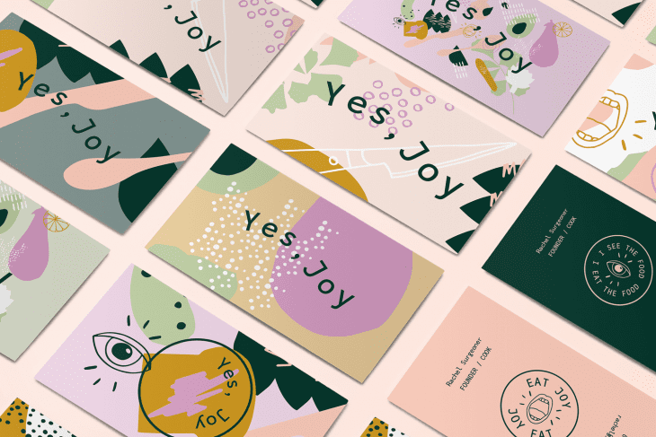
3. Maximalist cards – minimalism is great, but the opposite is also good. Quite often, more is more and taking the loud and bold route, full of bright colors, fun graphics, or extensive detailing is one of the ways to make your business stand out from the crowd. You might ask yourself, why does this work? Well, if you give someone your business card, you will want them to remember you. And what is a better way than creating a maximalist business card? Companies like Business cards NYC offers customers the chance to implement various things into their cards, making them unique and specially made for you and your company.

source: instructables.com
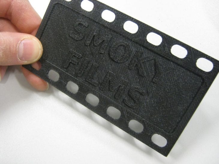
4. 3D design – if you want to implement an extra amount of fun and creativity into your design, one of the best ways to do it is by using 3D. You have various options when it comes to a 3D business card design. You can implement a 3D texture, like a raised logo, design your business card to fold into something or make your card moveable. Adding the 3D effect to your card adds flair to it. It is interesting, fun, unexpected, and will most certainly prove a lasting impression.
5. Photo-centric business cards – what is the most impactful thing you could add to your business card in order to leave a mark? Simply add a photo. When designing your card around a photo (which can be a photo of you, your product, or business), it can make it more memorable and interesting. For some people, text can be overwhelming and adding a photo can help your business card connect more to people who like visual art. A big bonus is if you use a personal photo, it will put a face to a name right away, and it will make it easier for people to remember who you are and what you are representing.

source: howdesign.com
Conclusion
If you want your business card to have a good first impression, portability, and the impact to build up your brand, creating one that is visually appealing, interesting, and something people are not expecting might help you get the right marketing tool.
