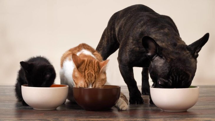
The offer is so varied that it became a purchase decision as complex as any food for “humans.” Years ago, pets used to be fed, more precisely dogs and cats, with leftovers from the foods that the same people consumed. There were some balanced foods that were limited to solving the problem of “what do I feed my pet?” The role of these products was merely functional, something that solved a specific need, but has now evolved, something which we discussed with HonestPaws before creating this article.
Contents
Affection motivates the purchase
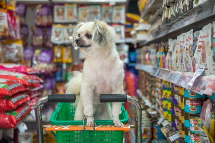
Generally, it was large packages without much charm, moreover, the large size of the bags did not help to create a sophisticated image and made its display difficult since no other product was that size in the supermarket. The place for these bags was extremely limited and was not exactly the most attractive place in the store. The graphic design of packaging in this category became more complex as the needs changed. Different design strategies were created to seduce the different types of owners.
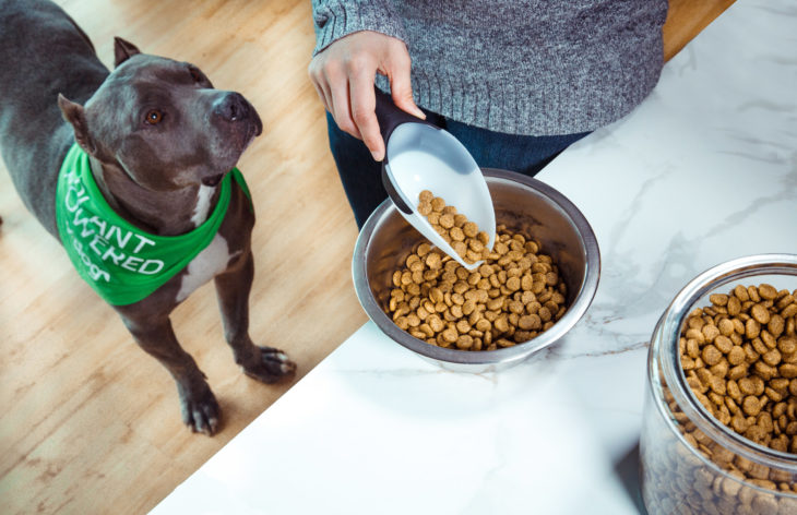
Functional discourse seems to no longer have much influence on the communication of these products because they have a large mobile purchase: affection. In general, a mere solution is no longer sought. In this category, emotion prevails over all things and must be aimed at the heart of the buyers to reach their true consumers.

Source: Mother Nature
A scientific look
The strategy of scientific communication is used by products with complementary components, such as vitamins and minerals, for those seeking nutritional quality. The benefits are usually detailed and highlighted through almost scientific graphics and descriptions. Dark backgrounds such as gray or black prevail. Some premium products use these resources, as they are aimed at those who have some technical knowledge or are particularly interested in the health care of your pet. It is a purchase decision with a rational edge that demands a certain degree of buyer attention.
Some brands, in addition to relying on a scientific endorsement, complement with pet images in scenes where they look adorably tender. In order to create a visual order, a rational sector is determined, where the product description and its main characteristics are located, and another emotional sector where the photograph is located. Vibrant and saturated colors are present, suggesting vitality and energy. Unlike brands with medicinal images, they seek a balance with the emotional by combining their quality credentials and the dynamism of the photographic scene.
Clear and precise differentiation
Although the approaches are different, there is some information that in all cases is treated similarly. In dog food it is common that within the same product line it is chromatically differentiated for what size of dog or for what age the food corresponds. This facilitates the identification task.
Own brands, also called white marks, generally use simple graphic systems that apply to all types of products, not just for pets. Something that the first brands avoid doing, in order to create a different branding concept for each specialty. Usually they do not rely on a speech that proclaims their experience and quality in the field, and this is precisely what represents a great opportunity to propose original designs that come out of stereotypes. The confidence that “buyers” have and the quality assurance is implicit in the same brand and in what the supermarket has built with its communication actions and with its full range of products.

Source: Inhabitat
Human strategies
On the other hand, many use strategies inspired by other product categories. They choose to look appetizing and tempting, just as food for “humans” does, which is curious considering that the buyer is not the one who will finally consume it. However, it is clear that the owners make the purchase choice thinking that they are giving their beloved pets what they think they would most like. In this case, the packaging design uses careful food photographs, highlighting the quality and freshness of the ingredients. For this type of packaging it is essential to have a good print quality and a good-looking material. That increases the expectation and the perceived quality of the product.
There are cases where the main character of the packaging begins to be an icon of the brand, it becomes a symbol. The sensations and characteristics of the animals and their behavior are associated with the heritage of the brand. Suggestive and tempting descriptions of the varieties and flavors are also used as the exclusive property of each brand. Evoking homemade preparations, selected ingredients or even culinary creations of a chef.
I want my prize!
Another of the edges of this category are dog biscuits, which are like the equivalent of treats that children love so much. These cookies are not a staple of food; therefore, they target an audience of high purchasing power. The breed that is chosen as an image for packaging design is key to product positioning. Small dogs do not feed in the same way as large dogs, and also represent different socioeconomic levels.
For owners who value products of natural origin and healthy appearance, there are also some options that use the graphic resources of cereals. This is one of the great opportunities to explore in this market. It achieves a clear differentiation from traditional brands and takes advantage of the positive values that are associated with health care.

Source: Stern
The game and the pets
Others, on the other hand, choose a more daring path by appealing to playful graphic languages, almost as if they were products for children. Despite not having photographs, it is possible to represent the tenderness of pets through the use of friendly cartoons, typographic choice and color.
This graphic approach is creating a new aesthetic trend that brings an air of renewal to the category. For now, they look like boutique products, which belong to a small and very specific niche. However, the marked growth of the pet accessories market reveals that what was a trend yesterday, today became a reality and represents a large part of potential buyers.
An analogy could be established in the psychology of buying pet food with baby food. In both cases the buyer is not the final consumer of the product, but is responsible for the choice. Your choice is a symbol of your affection. A mother chooses the best for her children, and the same goes for the owner who chooses the best for her pet. After all, for many people pets are like their children. For this reason, the packaging design of these products requires the use of the same codes with which other types of food communicate. They must speak in the same language so that they are understood and seduced.
