Every logo has its character and message strategy. One distinctive genre of logos among the many out there that is especially interesting is Women-centric Logos.
Gone are the days of pink and flowers – that stereotype has come and passed. Today, it is vital to appreciate the complexity that goes into differentiating the teenage girl vs. the businesswoman in her mid-40’s. Culture, background, geography, budget, and biases all matter too.
Women clearly can no longer be grouped into a single category or target for design, and we must appreciate that buying power comes with appropriate branding and design.
Logos that classify as being women-centric mostly belong to those brands that cater to the female population. They can cover cars, support groups, wellness, fashion, travel tours, and a wide gamut of fun, women-centric brands. It is important to remember that women drive consumer spending, accounting for 70-80 percent of all purchasing.
We’ve selected 10 of our favorites that stand apart as inspiring emblems of love, beauty, peace, and all the fascinating aspects of being a woman:
Contents
1. Circle of Hope
Source: logodix
A deep and meaningful logo design, the intention of which is to show human connection and support for traumatized women. An actual ring of hope on which the entire concept stands is an integral part of this logo design, as are the words encircling the name. Though the colored one with five vivacious shades sets a positive note, it looks pretty cool in its black and white versions as well.
2. The Feminine Way To Wealth
Source: designcrowd
Here’s a female, almost divine brand captured in a subtle, yet robust logo design. The pink and gold butterfly wings that glisten in a surreal manner represent feminine qualities in their most potent avatar. With women, less is always more, but with the Feminine Way, they are aiming for absolute abundance with this winner.
3. Your Car Shopper
Source: designcontest
An innovative pink idea with the cutest logo that no doubt appeals to the feminine eye. Though it may be referred to as being women-centric, we feel it could be a tad on the girl-centric side, especially relevant to her first set of wheels. Nonetheless, we like this one for its fresh approach that seems so simple but works pretty well due to easy recall.
4. Réseau-femmes
Source: twitter
A French word that stands for ‘women’s network’ represents so much more than just a group of femmes. This logo is a symbol of a fight against violence. Its subtle colors seem unassuming, but the bold blue emblem in its center represents strength and resilience. Quite delicate but yet so strong, this classy logo design and font truly fit the women-centric bill.
5. Lolly Dee
Source: designcrowd
This logo has that broad appeal that caters to women of all ages and walks of life. We like it for the authoritative nature that is a fashion statement in itself – the striking font, elegant colors, and, of course, the lady-like birdie and sugar-coated adjectives. Interestingly enough, Lolly Dee chose to use DesignContest to start their logo design contest, and as you can see, the winning designer produced an attractive & unique custom logo. Like the unique Lolly Dee clothing collection, the logo too is a mix of quintessential vintage tones and new world charm.
6. Celebrating HERstory
Source: designcontest
This logo is a tribute to women from an award-winning woman filmmaker. It belongs to a personal website and includes the right elements to get the message across – the film roll and the lady the colors. It’s sweet, graceful, and intriguing as the cause that it stands for.
7. FindYourWhy logo
Source: youtube
When women strive to uplift other women, it’s refreshing! Just like the find-your-why logo. The three swirls stand for the three tenets of our existence – mind, body and (its) nutrition! It’s attractive and useful for the target group that falls in the 20 to 50 bracket. Though pretty straightforward, it has a specific quirky, artistic side to it that we love.
8. Access Abundance
Source: twitter
The search was for something new and exciting (as always!). But the designers got it to spot on. This logo contains an infinity symbol that is open to multiple interpretations. It presents the brand words in a fun, easy to understand manner, which is sometimes a task with this personal growth kind of concepts. We also like the lively color palette and the gentle fading in and fading out of color and lines.
9. Lil’ Crickets
Source: pinterest
Good enough to eat, this logo is made in heaven for pregnant ladies and their tots! This adorable clothing brand takes you into a fantasy world and caters to child-like imagination. We can completely understand a soon-to-be mother aww-ing over this buzzing bee and its antics. The colors are well, delicious, and the fonts seem apt.
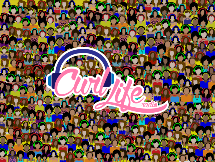
10. Curl Life
Source: youtube
Such a change from the usual minimalistic designs that like to keep it simple. This logo is a party with headphone clad women of all colors, shapes, and sizes. Its busy, high energy and full of chatter. You can hear it even without headphones! A highly effective logo for a woman networking station, especially for its accurate depictions of diversity and energy.
Conclusion
As you can see, there are no hard and fast rules to create a women-centric logo. The nuance of today’s modern woman in many cultures must be recognized and appreciated. Remember that women make a majority of purchases, so being flexible in understanding and approach will go a long way in delivering a design that fits and hits right.
Remember to appreciate not just the physical and emotional interests, but also where they are in their life. Whether a corporate leader, a rising professional, a pack of excitable teenage girls, or a woman who identifies as a power athlete. As long as your target audience can identify with the logo & you can create an eye-pleasure aesthetic, your logo will be sure to shine.
Let your charming, feminine design do the talking for you!
