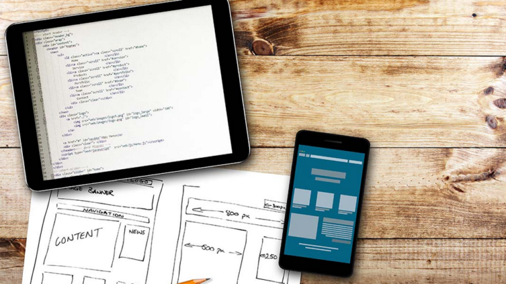
A well thought-out website is a thing that all businesses need in order to maintain professionalism in their field of expertise.
As much as 64% of businesses improve their websites by creating new, improved, copies of their older versions. Investing in the newest trends of website design is a smart move considering that your website is the front face of your business’ online platform.
So because of that, we are going to tell you the mistakes to avoid when building a website so you don’t have to do it again.
1. Having no Plan

Source: ChartYourTrade .com
Much like opening a store or a restaurant, having no plan is the biggest mistake you can make before building a website. It is the foundation of any kind of business, and the same applies to your website. Without a plan, you will never fully be able to organize everything and that will reflect on your website’s growth. Your targeted audience will want something from you, a unique selling proposition, which you won’t be able to fully give to them. Careful planning is your top priority as each stage of development should be well-thought and researched. In order to make it easy for yourself create a plan for your website.
2. Sloppy Design

Source: Snap Agency
As soon as you wrap up the planning phase, comes the part where you need to pay attention to your website design, according to website design experts at UtoMedia.
Starting with your homepage should be your top priority, as it is your website’s landing page which every new visitor visits first. Make sure your homepage to be as free as possible, as you don’t want it to be cluttered with useless information. A website allows you to create so much content for online viewing, but it needs to be organized rather than stacked on your homepage.
Another thing that closely relates to your website design is the font size. Namely, there are a lot of websites that overlook this simple thing but it has so much power. Your font type and font size play a vital role because most people will instantly overlook you if they can’t read what you’ve written. Text’s that are too difficult to read, font size below 14px, will drive so much traffic away due to the various readability issues.
3. Not Mobile Optimized

Source: SmallBizClub
It’s 2019 and people use their phones more than they use personal computers. While we all like to browse Google with a mouse and keyboard, many people don’t and they use their smartphones for it. According to statistics, 60% of all online searches come from smartphones, and 80% of website visits come from social media outlets. It is precise because of this that your website must be mobile optimized. Since Facebook, Instagram and Twitter are predominantly used and optimized, for smartphone viewing, it is from these platforms that most website visits come. If you want your website to truly be a success, then you must optimize the various layouts of your website to appeal more to mobile users.
One way to solve this problem, even if you are not an expert, is to view your website through your mobile as you build it to make sure it translates well.
