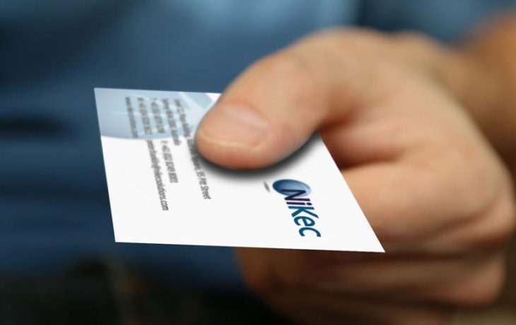
Though you might think that the only purpose of business cards is to offer people a simple way to contact you, that is not entirely true – especially since the cards can provide people with so many more things. Besides it featuring your contact info, they are also useful tools for marketing yourself and your company, as well as for implementing a call-to-action for your clients.
The business card you choose will be the most crucial part of your marketing efforts, and it is a visual add-on to your entire brand concept. However, you might have hit a brick wall when you started thinking about what it should look like. But, fear not! This article can help you, especially since it will feature the top things you should consider before choosing the design of your business card. Let’s take a closer look at the tips:
Contents
Things to Consider When Designing

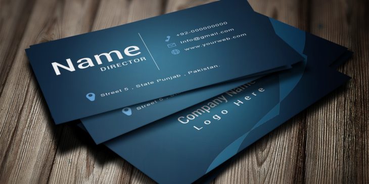
Source: Unblast
Like with everything else in life, there are some things that you should consider. The thing you should carefully think about include:
1. Think About The Shape And Choose One
If you previously opted for using the conventional square ones, you can continue reading from the second tip right away, but, if you did not, you should keep on reading. Since printing tech became innovative and cheap, there are various shapes that you can opt from and explore. A printing method called “die-cutting” will allow you to cut any shape that you imagine.
Of course, you might go with the traditional, round-cornered ones, yet, if you desire to be more creative and make your brand stand out from the crowd, you can choose literally any shape such as an animal shape, an outline of the items you offer, as well as a form that is entirely original. An additional thing that you should think about is whether or not it will fit in a usual wallet.
2. Opt For a Proper Size
The following choice you must make is the size of the labels. This will depend on the things you wish to achieve with them, however, there are some traditional sizes that you might want to consider including the American norm (3.5 x 2 inches) or the European norm (3.34 x 2.16 inches).
No matter what size you choose, there are 3 things to think about when creating them, including the bleed section (the piece of the paper that will be cut), the trim edge (which is the objective line for cutting), and, of course, the safety area (anything that is outside this field means that there was a cutting error).

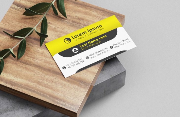
Source: Codester
3. Add a Logo And Additional Graphics
Once you are done with the aforementioned things, you need to start thinking about the optical characteristics of the design, and naturally, the first thing you should consider is the logo you have. The logo needs to be placed in the center of the scheme. The one thing you should keep in mind is that you have 2 available surfaces.
One tip that you might want to follow is to utilize one side specifically for the logo, while you use the other one for featuring your contact info and other things that you might want to add. Although minimalism is advised, you can also fill in the empty areas with extra graphics. If you want to see what professional services you can opt for, check out Crescent Printing.
4. Add The Text That You Need
The things written on the cards will depend on your preferences. If you are, for example, working for home, you won’t need to add an address, but, if you are, for instance, a lawyer, an address is the most crucial thing you can state. Of course, the text on them should be clear to read and the font you choose should be simple.
Some of the most common things to add to the cards include your name, your company’s title, the business title, telephone number, email address, website & social media URLs, your address, a motto, and a QR code if you truly want it to be modern. These cards are not only about giving info, but they are also about retaining it.

Source: Dribbble
5. Think About Adding A Unique Finish
Now that you have decided on the most essential things, you can start thinking about the printers – especially the things they can offer. Specific printers can add special finishes to your cards, hence, you might be able to easily make a long-lasting impression. The finish you choose will depend on how you want the card to feel like when touched.
The surface you can pick from include embossing that can provide 3D features, letter pressing that forces the paper to create an engravement, foil stamping that can add shine and luxury to your design, as well as a spot UV coating that will leave a smooth texture and shine.
6. Finalize Everything
When you have chosen the aforementioned things and when you have decided on your colors and finish, the next thing that you should do is to reevaluate all aspects of your card in order to ensure that everything will look and work well. This literally means that you should double-check all features of your business card design.
Start by examining the card, what are the first things you notice and what are the last? A proper visual flow needs to begin with a logo, then your name and secondary text, and last the additional visual aspects. Also, keep in mind that your card should not look messy or cluttered, hence, if there is something that is unnecessary, remove it.

Source: Pinterest
Conclusion
As you can see, there are various things that you need to consider when choosing a business card. And, by following the tips mentioned in the list above, you’ll be able to create one that will make you and your company stand out from the crowd. Hence, now that you know what you should think about, do not waste any more time. Instead, design your business card by thinking about the first tip from this article, which is determining what shape it will take.
