
I was 6 years of old when I stole my first chocolate. My mother lectured me for an hour regarding sin and how stealing things can lead me to hell? When I was 10, I stole my classmate’s lunch and ate it. I don’t really remember what happened next but what I do remember was my classmate ready to take his revenge. The world got black after that, for a few years and I woke up in the hospital.
The point is, just like good deeds, sins leave their own effect. Whether you are working in a company or have their own company, you need to start worrying about the sins that you did.
If you’re in graphic designing, and I am sure you’re, because you’re reading this blog to gain read about the sins that can save you from going to hell.
Contents
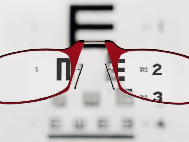
Customers need a magnifying glass to read
The first mistake that most of the website designers make is they use tiny fonts. These fonts might look good or fit right in the theme, but when it comes to user experience, they leave a negative perception towards the users.
The sole reason is that earlier using small fonts was in fashion. The standard practice was to use 12 px fonts which was followed by everyone else.
But as things evolved, people realized that it was impossible to read online with 12 px fonts.
On the other hand, the myth that humans have less attention span than of a goldfish created an atmosphere of tension among website owners.
I don’t know if the myth is true or not, but it is true that users of today don’t have enough time to wait and try to read when the reading is difficult.
Here are some ways in which you can hold the attention of users for long:
- Write interesting content to grab the attention of the users.
- Use fonts in the headline that demand attention.
- Ensure that the fonts in the body of the text are big enough that users can read even in their mobile devices.
For this reason, the average size of fonts must be 14 px to be minimum and up to 18 px.
The Sliders that keep moving
I still couldn’t figure out why some of the website owners still prefer to use sliders that keep moving.
To me they are irritating, and the same goes for visitors that are visiting your website to buy something.
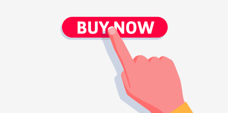
If you’re following website design trends, you will realize that a good website is all about eliminating all the barriers that come in the way between the visitor and the shopping cart.
With limited attention of the users, it’s extremely difficult to hold the attention of the users.
Many of the experts believe that sliding banners can cause banner blindness. People consider banners as ads floating on the screen. They usually close the banner and ignore them.
A study revealed that only 1% of the total visitors click the side banner while 84% of the customers click on the first item that appears on the page.
The website owners need to know and understand that will sliding banners help them convey the right message to the visitors? Sometimes what you need is a professional agency. Try this Toronto web design company. You won’t be disappointed a bit.

Using Fonts with Negligible Contrast
Another common mistake that the website designers make while designing the website is using low contrast with fonts.
What is low contrast? Low contrast is simply using light fonts on a light background or dark fonts with a dark background.
You need to ensure that the fonts of the website are readable enough. The Smashing magazine shared that the light that gets into our eyes at the age of 40 is different and the light that comes to our eyes at the age of 20 is different.
Do you think that this proof is not enough to use fonts that look good on your website background? Low contrast is a bad idea.
You can cater this by using light fonts on a dark background or light background with light fonts.
Sometimes designers prefer to use the gray font on a white background which looks good on a blue background.
Lousy Line Height for the Font
Most of the web designers overlook the line height of the text. A normal process of designing goes like this: A designer pick the font, choose a font size, select line height, and retire the day.
But the expert designers spend enough time on every single element. And line height is something which is significant.
A simple line can impact the overall design and appeal of the website. Choosing the wrong line height might give a feeling of the crowded website.
Professional web designers have a good eye to things. They choose the right line height automatically. But the bad news is that the average designers don’t know a thing about line height and they prefer to go with the default settings.
Don’t act like an average designer. Study the ideal height of everything before you start sketching the design on paper.
Do you think colors reflect our decisions?
If you think they don’t, you are wrong. The psychology of colors is a science. If you learn the science of colors, you’ll be able to grab the attention of more visitors.
Here are some rules that you can follow with your Call-to-action buttons to keep things into perspective:
- The bright colors always draw attention.
- Ensure that colors on the website are complementing all the colors on your website.
- The color on Call-to-action (CTA) buttons must stand out on a background. This means that it will not be wise to use the blue color font on a blue background font.
- CTA buttons are special, so they need to be used to draw some action.
Try Not to Commit Design Violations
The final and most lethal mistake that you can make as a designer is violating the common design principles. For this, I would suggest reading Don’t Make Me Think by Steve Krug.
For instance, the logos and taglines are meant to be seen at the top on the page. The menus are at the top along with the contact page. This means it is necessary to include these elements as they are on other websites.
It’s okay if you’re willing to experiment with the design. But ensure that you don’t experiment on the main page. Be creative on inner pages. Take help from the best practices that are being used by top website design websites.

To wrap it all up
Now with these principles in mind, you can look at every website with a critical angle. See and learn how the websites are using these principles and save yourself from being thrown into hell.