
There are a variety of ways of creating robust, impactful designs that resonate with audiences universally. While design trends continue to evolve, some aspects of design remain steady or resurface in implementation over and over again. One such aspect is the use of gradients.
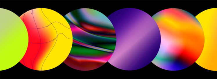
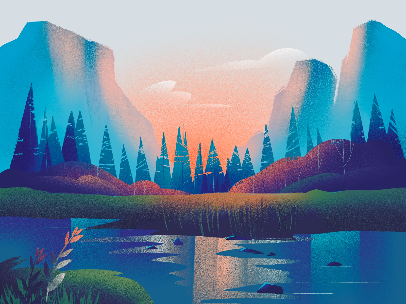
Highlighting and accentuating various aspects of design from backgrounds to brand logos, using dual or tri-color combinations can be found in nearly all aspects of design. The great thing about gradients is their versatility, improving the aura and perception of the method in which they are implemented, especially in enriching and adding depth to design that might otherwise come off as flat.
They can be applied with a variety of color combinations, as well as in multiple layouts. Some gradients tile vertically, some horizontally, some come in an angular form from corners, while many spread clockwise or counterclockwise from the center. There are hardly any limits to the possibilities in which they can be leveraged to bolster the overall appearance and feel.
An excellent way to stay ahead of your design competitors is to take a fresh look at the application of gradients in your design. While they have been around for a while, they have fallen out of design conversation for a spell. Still, they have recently become a hot topic in the design sphere, with many designers and agencies looking to leverage old concepts in fresher, more innovative ways. These methods may not all end up being revolutionary; there are plenty of excellent examples of new, effective methods of gradient applications. Some of them, implemented in the works of design agencies, you can see at bootcamp.uxdesign.cc.
Gradients are simple conceptually and yet complex all at once. They certainly carry a lot of power in making the design more interesting, but there are aspects about them that can be somewhat confusing. We will discuss some of the finer points necessary for understanding gradients and their optimal method of application in the hopes of helping you to capitalize on their power to enhance your website and bolster the positive feedback from your customers.
Contents
Selecting The Right Colors
Any designer worth their salt knows that the use of colors can make or break a gradient, affecting the overall design positively or negatively. Because colors can dictate the entire style of a site or an application, when choosing the colors during setup, it is imperative to exercise caution and good judgment in one’s selections.
When you feel stumped about colors to use or hit a roadblock, you can always go back to basics. When working to find complementary color schemes, it is always recommended that colors from the same color family are considered first.
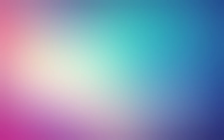
Color shading is another crucial aspect to think about, as lighter color shades can have a dramatically different effect on your final design. Also, while colors in gradients have a lot of versatility, their application needs to consider the images, text, and other site content they will be working with to see if they truly fit a particular design schema.
Some designers try to implement many colors into their gradient, which often turns out to be erroneous. However, using two or three appropriately chosen colors works wonders in terms of gradient design. Too many colors tend to make a design hard to look at, thereby degrading the prime directive of good design, and that is to be appealing to the viewer’s perception. Of course, it is not impossible to implement more than three colors in sound design, it just takes a balanced approach and carefully chosen combinations to succeed.
Setting A Smooth Tone
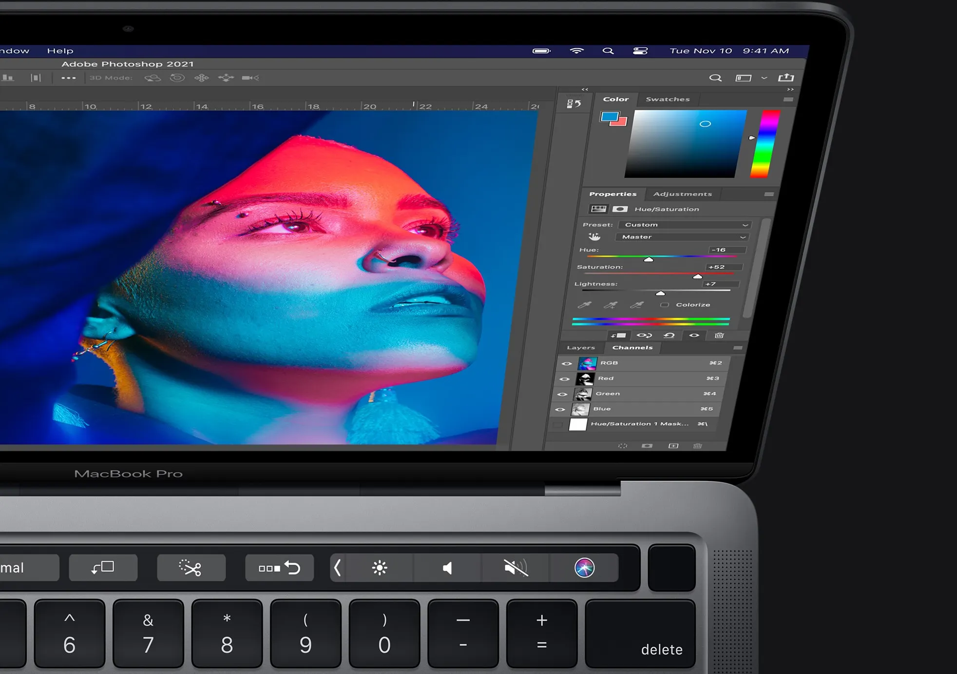
Many designers using Photoshop may not be aware of the powerful “Dither” button. Unless banding appears in the create gradients, this is an aspect that can go unnoticed by a designer. The bands can, at times, be overly evident in their rectangular manifestation. Therefore, they are not visually pleasing and, therefore, via the Dither button, can be smoothed out until the point where they are nearly invisible.
The idea is to blend the colors of a gradient smoothly and as seamlessly as possible. Designers who like to be more daring and experimental by using more than three colors in their gradients have to be especially aware of the importance of having those colors blend without allowing for jarring color shifts. The lack of doing so will manifest in a result that is not visually appealing to the viewer.
Choosing The Correct Places For Use Of Gradients
While they are effective, their placement is an essential component in considering where they will be used. Since gradients have a bold, prominent presence, good judgment should be used in deciding where they will be most optimally placed for maximum efficacy. In some situations, they are best not used at all, as in websites meant for serious, direct matters, such as government agencies and hospitals.
When applying gradients, it is also essential to consider how they contrast or balance out with the white space on the site. After all, it can’t all just be a color party. The design needs to be able to “breathe.” For instance, when it is used in the background, it needs to have its overpowering nature’s power checked by the subtle use of white spaces around it.
Another consideration is the content volume used when gradients are in play. The prominence of the colors can ruin the readability of text, causing a worse viewer experience, leading to poor reception of design. When content is minimal, background gradients can still lead to a cleaner, more visually pleasing design.
Using Gradients In Illustrations And Logos
Using them with logos and illustrations presents a steeper challenge as there are only so many of them that can work with a particular image. For instance, when your pictures are linear, gradient use is typically unadvised as its application tends to dampen the ability of colors to pop, leading to a loss of the illustration’s charm.
When scaling images for smaller display dimensions, gradients can cause images to appear distorted. It might be best to use filled or isometric illustrations in these cases as it allows the photos to have a more 3D-like effect.
When representing a brand or its trait image on a B2C site, the use of gradient is highly recommended as it is typically the best way to display a brand’s personality in a more light-hearted way. However, it is essential to ensure that the color combination and flow are reflective and complementary to broadcasting the brand’s values across the entire design spectrum when using gradients for this purpose.
What To Avoid When Using Gradients
Gradient Use In Paragraphs
Because they tend to reduce readability, it’s best to avoid using them in tandem with long blocks of text. Often, designers minimize the size of the text content, which makes the readability against gradients in the background even more problematic. Typically, if the text is included in a design, it is intended for the viewer to read, meaning that if a long text form is utilized, it is probably best to steer clear of gradients or to have the text be larger and more broken up.
Headers and footers of websites rarely benefit from gradients as they are more conducive to be viewable with flat colors. These are the areas of a site that usually contain menus with navigational elements, so their readability mustn’t be degraded by gradients, especially since the text size on these menus can only be so big.
Final Thought
Hopefully, all of those tips can help in strengthening your ability to apply gradients in your web design. Apply these concepts in your next design project for optimal visually appealing and positive emotion evoking results.